View objects are objects which display data or can be used to edit data and settings. This may be to view a map, table, option or channel. For how to add objects see the Adding an Object section.
The following list (excluding “Manipulating view Objects”) are all the object types and what they are used to display.
Click the add object icon in the GWv4 toolbar. By default, the icon will look like a map graph ( ), but will change to the last added object’s icon once you have added one. Clicking the down arrow will bring up a list of all the available objects to choose from, clicking the icon itself will add the last object added.
A list of available channels/maps/options will appear for the object you have selected. Here is an example list for a Tacho:
Select the data you wish to display then click ‘OK’.
From the View Explorer click and drag the object you wish to display into the tab area, as shown below:
Right click on a blank area of the tab. This will provide a list of all objects that can be added, as below:
Select the object you wish to add then select the data you wish to shown from the pick list as shown in the first option.
Note
You can display many more than one of each object type, in fact there are no limits on how many objects you wish to add!
Inserting Options and Channels
Options and channels may be inserted into existing lists by dropping them on the ‘insert’ docking hint:
Multiple Selection
Multiple items may be selected in the views tree use Shift and click to select ranges and the Ctrl button to toggle items when clicking with the mouse.
To drag the items, press and hold the left mouse button on an area that is highlighted to begin the drag.
If multiple options or channels are selected, then they will be combined into a single list.
Customising Objects
All view objects in GWv4 can be customised in a number of ways:
Renaming
All objects can be renamed. This can be especially useful for renaming a Channel List as to the channels that is has listed, or renaming a notes object to describe the notes it contains. To rename an object simply select the object and then access the context menu.
To access the context menu, simply right click on the object. Alternatively, press the Context Menu key (to the right of Alt-Gr) whilst the view is focused. Some keyboards do not have a context menu key, in which case you can use Shift-F10.
Once the context menu is open, simply select the ‘Rename’ option. Type in the new name for the object, and the object will now be renamed.
Locking
Option Full List, Option Selection List and Channel List can be locked so that the items they display can not be accidentally changed. To do this , right click on either a option list or Channel List and select ‘Lock’. Now the current items can not be changed and new items can not be added until the object is unlocked. To unlock a list simply right click and select ‘Unlock’. You will now be able to make changes to the list.
Grouping Objects
Multiple objects can be grouped together in the same object. These objects then appear as tabs in a singular object as shown in the following picture:
This grouped view saves screen space, allows you to quickly swap between several representations of the same data, and lets you add other useful views such as in this example where a note on how to set up a fuel map has been included.
To do this, click and drag an item you wish to group over the top of the other, where a box will appear in the centre of the window. Dragging the item to that box will highlight the other view’s window and releasing the mouse button will group the windows, shown here:
To remove an object from a group, simply click and drag its tab at the bottom of the group away from the group and release, this item will now be separated.
Changing Objects in the Same View
For some views, you can change the object that you are viewing by clicking on the ‘…’ button in the caption bar of the view.
This will then offer the option to pick a new object to display in the same view.
Alternatively to cycle between objects if you just want to do a check over all of the maps/tables for a calibration, use the options in the layout menu:
Change View to Previous Object - If the selected view supports it, cycle through objects (e.g. maps) in the same window.
Change View to Next Object - As for Change View to Previous Object, in the opposite direction.
These have the keyboard shortcuts ‘Ctrl-Shift-PGUP’ and ‘Ctrl-Shift-PGDN’ respectively by default. These can of course be configured to whatever you like - see Configure Shortcut Keys.
Manipulating the Layout
Windows within tabs may be moved by grabbing their title bar with the left mouse button and dragging.
Selecting windows
To select a window (or multiple windows), drag from an empty space in the tab using the left mouse button. This should display a blue ‘rubber band’ selection box. Continue dragging the mouse so that the windows that you wish to select intersect with the rubber band box:
You can also select windows by holding down the ‘Ctrl’ key and clicking on the title bar of the windows that you wish to select. This method can also be used to deselect windows.
Moving a selection
The selected windows can be moved by left mouse button-dragging the selection highlight area.
Copying a selection to another tab
Invoking the context menu on the selection (right mouse button or context menu key), will allow you to copy the windows:
Once copied, select the tab that you want to paste the windows into and invoke the context menu in a blank area of the tab. Select ‘paste’ from the context menu.
If there are no blank areas, select the layout sub-menu from a child window context menu.
Resizing selected windows
The selected windows may be resized by using the resize handles at the corners of the selection. Use the left mouse button and drag the handles to resize.
Closing selected windows
The selected windows may be closed by selecting ‘close windows’ from the context menu of the selection highlight.
Audit
The Audit View enables the construction of node-based graphs that show a dynamic visual flow diagram between objects in the ECU (channels, tables, maps etc).
Audits graphs consist of nodes (the large square boxes in the diagram above). Each node has junctions which are the small circular attachments on the edges of the nodes. Junctions may be connected to other junctions by edges to indicate data flow.
There are multiple types of nodes.
Object Node - Displays an ECU based object (e.g. channel, option, table etc).
Submodule Node - Contains a diagram of its own (another node graph). Double clicking on a submodule will display its contents when the layout is locked.
Jump Module Node - Jumps to a submodule - this is like a shortcut to a submodule that exists somewhere else in the node graph hierarchy.
Notes Node - Displays notes to describe the graph in more detail.
At the top of the audit view is the module bar. This has navigation buttons to the left that enable traversing through the history of nodes that have been viewed during the current session.
To the right of the navigation buttons, the current node is displayed and its parent graphs. Clicking on one of these will jump to that view. There is additionally a drop down menu for jumping to other locations in the graph tree.
View Properties
Properties editable via the properties editor.
Property
Script ID
Description
Title
title
The title of the window.
Script ID
id
The scripting ID of the window. Can be used as an alternative to the title for searching for windows from scripts.
Tool Tip
tooltip
Window tool tip.
Locked Layout
locked
Locks the layout from being modified with the mouse.
Snap To Grid
snap_to_grid
Snap positions to grid.
Snap To Objects
snap_to_objects
Snap egdes to objects.
Bar
The Bar Gauge is used to display a channel value as a bar. For how to add objects see the Adding an Object section.
Changing the channel
Right click on the Bar Gauge and select properties. This will display the properties for the Bar Gauge. Next to the ‘Channel’ property click the ‘…’ button and you will be given a list of all the available channels.
Bar Gauge Orientation
The Bar Gauge can be viewed as either vertical or horizontal. To set this bring up the Bar Gauge’s properties, and simply set ‘Orientation’ to either vertical or horizontal:
Displaying the Current Value
It is possible to display the current value as text in the Bar Gauge by going to the properties window, and setting the ‘Display Value’ property to ‘Yes’:
Setting the Range
Bring up the properties for the Bar Gauge. Set the properties ‘Minimum’ and ‘Maximum’ to your desired values for the Bar Gauge range.
Alarm Range
An alarm range can be configured. Select ‘Limits…’ from the context (right click) menu, or ‘Limits’ from the properties.
If an alarm limit is reached, then the colour of the background will change to the colour selected in your settings. The default is red:
View Properties
Properties editable via the properties editor.
Property
Script ID
Description
Title
title
The title of the window.
Script ID
id
The scripting ID of the window. Can be used as an alternative to the title for searching for windows from scripts.
Tool Tip
tooltip
Window tool tip.
Orientation
orientation
The direction of the bar.
Display Value
display_value
Display value on the gauge.
Label Decimals
label_decimals
Precision of axis labels. Set to -1 for auto.
Input Value
parameter
The input value that will be displayed by the bar.
Update Rate
update_rate
Rate at which the input value is requested from the ECU.
Minimum
minimum
Minimum value.
Maximum
maximum
Maximum value.
Major Ticks
ticks_major
Number of major ticks. Use '0' for automatic handling.
Label Font Size
label_font_size
Size of the font used to draw the major tick labels.
Label Font PointSize
label_font_size_pts
Size of the font used to draw the major tick labels.
Limits
limits
Set up alarm limits for this gauge.
Button
The Button View provides a configurable button that may be used to execute scripts when it is clicked, and allows advanced configuration/control templates to be constructed.
Button scripts should define an onClick function that is called when the button is clicked. The default script for a newly added button should contain an empty onClick function ready to be filled in.
'button' of type Button. This a reference to ’this’, for convenience and readability.
View Properties
Properties editable via the properties editor.
Property
Script ID
Description
Label
label
Sets the button label. Set this to nothing to get action/wizard text, if defined
Show Label
show_label
Show the label on the button or just the icon.
Icon
icon
Button Icon
Stretch
stretch
Stretch the button to fill the view contents.
Script
script
Edit the button script.
Action
action
Action to invoke when clicked. This is more efficient than using a script for the same puropse.
Title
title
The title of the window.
Script ID
id
The scripting ID of the window. Can be used as an alternative to the title for searching for windows from scripts.
Tool Tip
tooltip
Window tool tip.
Channel List
The Channel List provides a customisable list of available channels. This is useful to group similar channels or those which are used together. The Channel List works in the same way as the Option Selection List, just for channels not options. For how to add objects see the Adding an Object section.
When the ECU is offline, the values in the Channel List are greyed out.
Adding Channels
When a Channel List is added you be shown a blank list with a single blank entry:
To add an channel simply start typing the name of the channel and GWv4 will provide a list of likely options or click the ‘…’ button and you will be shown a list of all available channels. Select the channel you want to display and click ‘OK’. This will add the selected channel to the list and provide a new blank entry from which to select another channel:
Adding Multiple Channels
From the channel selection list you can add multiple channels. Click on the ‘…’ button to bring up the available channels, then either click and drag over the channels, or use mouse click and either Shift or Ctrl keys to select separate items.
Once selected, click ‘OK’ and the items will be added to your selection list:
Setting up Limits
For each channel displayed you can set up limits. This can either be to set the range of values (view range) displayed by the bar or to set warnings if the value goes above or below certain values (alarm range).
Right click on the channel in the list you want to set a limit for and click on limits, alternatively simply use the keyboard shortcut Alt+L and the following window will be displayed:
The view range, and alarm range can then be set for the channel. If set then they will automatically be enabled, though they can be disabled again by simply un-ticking the enable box.
If the channel then goes out of the alarm range, the channel will go red, as can be seen in the Bar section.
Locking the list
The list can be locked by clicking on the padlock icon in its title bar. This prevents items being added or removed from the list.
View Properties
Properties editable via the properties editor.
Property
Script ID
Description
Title
title
The title of the window.
Script ID
id
The scripting ID of the window. Can be used as an alternative to the title for searching for windows from scripts.
Tool Tip
tooltip
Window tool tip.
Font Size
font_size2
Size of the text used in the list.
Minimum Font Size
min_font_size
Minimum size of the text used in the grid with auto font size.
Maximum Font Size
max_font_size
Maximum size of the text used in the grid with auto font size.
Auto Font Size
auto_font_size
Automatically determine the font size based on the size of the grid.
Alpha Sort
sort_mode
Sort items in the grid alphabetically.
Condensed
condensed
Condenses items into groups based upon the first word in the name.
Expandable Min/Max
expandable_minmax
Sets whether this view can display minimums/maximums in a tree based format.
Min/Max Ticks
minmax_ticks
Sets whether this view displays min/max value telltales.
Value Bars
value_bars
Sets whether this view displays bars indicating values in the value column.
Name
show_col_name
Sets whether this view should display the 'name' column.
Identifier
show_col_ident
Sets whether this view should display the 'identifier' column.
Display Identifier
show_col_display_ident
Sets whether this view should display the 'display identifier' column.
Long Identifier
show_col_long_ident
Sets whether this view should display the 'long identifier' column.
Description
show_col_desc
Sets whether this view should display the 'description' column.
Selected
selected
Selected sites.
Freezable
freezable
Sets whether this view is frozen when 'Freeze Mode' is enabled.
Channel
The currently selected channel.
Update Rate
Rate at which the selected channel(s) update.
Limits
Set up limits for the selected channel(s).
Decimal Places
Number of decimal places to display.
Checkbox
The CheckBox View provides a configurable check box that may be used to execute scripts when it is clicked or changes state, and allows advanced configuration/control templates to be constructed.
CheckBox scripts should define an onClick and/or an onChanged function that is called when the checkbox is clicked or changed state. The default script for a newly added checkbox should contain an empty implementations of these functions ready to be filled in.
This script enables another control with the script ID 'some_editor' when the checkbox changed value either through clicking it or when another script changed its value.
To make the checkbox interact with an option:
// Get a reference to the option of interest.
varbarocorr=gin.options.find("Baro Correction");
functiononGetValue()
{
// Get the value of the on/off option.
returnbarocorr.getReal();
}
functiononSetValue(checked)
{
// Set the value of the on/off option.
barocorr.setReal(checked);
}
When accessed via scripts, the checkbox text can be accessed by the 'text' property and its value by the 'checked' property:
varcb= window.findViewByID("my_checkbox");
cb.text="Bingo";
cb.checked=!cb.checked; // Toggle value
Checkboxes define the following global variables in their scripts:
'view' of type CheckBox. This a reference to 'this', for convenience and readability.
View Properties
Properties editable via the properties editor.
Property
Script ID
Description
Label
label
Sets the check box label.
Exclusion Group
exclusion_group
Mutual exclusion group (Radio Group). Only a single control within the same exclusion group may be checked.
Script
script
Edit the script for custom actions / value calculation.
Title
title
The title of the window.
Script ID
id
The scripting ID of the window. Can be used as an alternative to the title for searching for windows from scripts.
Tool Tip
tooltip
Window tool tip.
Label
label
Sets the button label.
Font Size
font_size
Size of the text.
Dial (Pot)
The Pot View provides a mouse-adjustable dial for editing channel and option values. Additionally it is possible to add scripting to the control in order to provide more complex control of values.
A channel or option may be selected using the box underneath the dial. If the selected object is a map modifier then the program button will be visible. Clicking on the button will perform the same action that the virtual pot box program button does by applying the adjustment to the current map site and resetting the channel to zero.
The label, object selector and program button visibility may be overridden by setting the appropriate Properties Window. Additionally the text of the label may be set via the 'Label' property. If the property is left blank then it will be set to the name of the selected object unless a script is specified.
If a script is specified for the control then the object selector will be disabled since the script is mutually exclusive. To disable the script, see the 'Enable Script' property.
If the script defines a function called 'onProgramButton' then the program button will be visible and call that script function when clicked.
Scripts may define the following functions:
onGetMin(): Allows the minimum value for the pot control to be specified.
onGetMax(): Allows the maximum value for the pot control to be specified.
onGetValue(): Should return the current value of the pot control.
onSetValue(value): Will be called when the value of the pot control has been adjusted by the user or implicitly.
onProgramButton(): Will be called if the program button is clicked by the user.
View Properties
Properties editable via the properties editor.
Property
Script ID
Description
Title
title
The title of the window.
Script ID
id
The scripting ID of the window. Can be used as an alternative to the title for searching for windows from scripts.
Tool Tip
tooltip
Window tool tip.
Show Label
show_label
Show/hide the label
Show Value
show_value
Show/hide the value
Show Selector
show_selector
Show/hide the object selector
Show Program Button
show_pgm_button
Show/hide the program button for modifier channels.
Label
user_label
Overrides the default label
Value
value
Sets the value.
Use Extended Limits
use_extended_limits
Allow values to be set for extended limits.
Show Extended Limits
show_extended_limits
Display extended limit range(s).
Use Custom Limits
use_custom_limits
Use custom minimum / maximum for this control only.
Minimum
custom_minimum
Custom minimum for this control only.
Maximum
custom_maximum
Custom maximum for this control only.
Script
script
Edit the button script.
Enable Script
enable_script
Enable the script (prevents script overriding direct object connection).
Object
object
Enable the script (prevents script overriding direct object connection).
Group
The Group View allows a number of other views to be contained within another movable view. This allows configuration/control panels to be created.
Groups can either be created by adding a new group and then adding sub-views to it, or by box-selecting some views and selecting ‘Group in sub-panel’ from it’s context menu (right click).
For creating advanced configuration/control panels, the Group View is very useful. From the right click menu, you can select default show/hide states for the sub-window title bars and borders. Typically you’ll want to hide the title and borders if you are trying to create a native looking form.
See Grouping Objects in the Manipulating View Objects section for more grouping details.
View Properties
Properties editable via the properties editor.
Property
Script ID
Description
Title
title
The title of the window.
Script ID
id
The scripting ID of the window. Can be used as an alternative to the title for searching for windows from scripts.
Tool Tip
tooltip
Window tool tip.
Image
The image object allows you to place an image on your workspace. This maybe useful for display a diagram, some scanned in notes, or a company logo. For how to add objects see the Adding an Object section.
When the Image object has been added you will be asked to select a picture files from your computer. Use the file browser to locate the files you want to show and click ‘Open’. The selected picture will then be displayed:
To change the picture, right click on the image and select Load Image.
View Properties
Properties editable via the properties editor.
Property
Script ID
Description
Title
title
The title of the window.
Script ID
id
The scripting ID of the window. Can be used as an alternative to the title for searching for windows from scripts.
Tool Tip
tooltip
Window tool tip.
Image Filename
image
Selects filename to use for the displayed image
Background Colour
background_colour
Background colour for the image panel
Stretch
stretch
Stretch image to fill view
Fixed Aspect Ratio
fixed_aspect_ratio
Maintain image aspect ratio when resizing.
Align X
align_x
Horizontal image alignment.
Align Y
align_y
Vertical image alignment.
Label
The Label View is very similar to the , but is displayed as static text and is not directly editable.
This is useful for developing advanced configuration/control panels.
The label text is processed to replace $[Units Name] with the units of the specified user Units (e.g. '$[Load Units]' might become kPa, and '$[Speed Units]' might become mph, depending on the user units selection).
If you need to display something beginning with '$[' then start it with a double sigil, '$$'. Any double sigil will be converted to a single character.
When accessed via scripts, the label text can be accessed by the 'text' property:
Enables mouse-dragging of the label to adjust the value of another view, specified using its 'script ID'.
Title
title
The title of the window.
Script ID
id
The scripting ID of the window. Can be used as an alternative to the title for searching for windows from scripts.
Tool Tip
tooltip
Window tool tip.
Text
text
Sets the label text.
Icon
icon
Sets the icon.
Padding X
padding_x
Padding in the horizontal (x) direction
Padding Y
padding_y
Padding in the vertical (y) direction
Align Horizontal
text_align
Text alignment in the horizontal (x) direction
Align Vertical
text_valign
Text alignment in the vertical (y) direction
Font Size
font_size
Size of the text.
Bold Font
font_bold
Enable bold/normal text.
Word Wrap
word_wrap
Enable word wrapping.
Divider Line
divider_line
Enable display of divider line (s).
Log Map
Log Maps monitor and store a pre-defined channel into the map at sites corresponding to those of a base map. For example, a Lambda Log Map would log the lambda channel, based upon the Fuel Map. As the load and speed approach a particular site in the Fuel Map, the value of lambda is logged into the Lambda Log Map at the corresponding site. As more values of lambda are collected for that site, the site value is averaged out. As engine load and speed changes, the initially empty Log Map is built up to show how lambda changes across the entire load and speed map.
Log Map Views
There are various view to choose from:
Log Map Controller allows log mapping and auto mapping to be configured.
Log Map Grid 2D view of the values of the logged channel that have been stored for sites in the base map. Similar to Map Grid views. It will initially be empty and will be filled once the desired channel is being logged.
Log Map Graph 3D version of the Log Map Grid. Similar to Map Graph views.
Log Map Slice displays a slice through the Log Map in the same way as Map Slice views.
Log Map Site Target displays the current site positioning in the same way that Map Target views do.
Log Map Target Grid 2D view of the target values used in auto mapping. Similar to Map Grid views.
Log Map Target Graph 3D version of the Log Map Target Grid. Similar to Map Graph views.
Log Map Target Slice displays a slice through the Log Map target in the same way as Map Slice views.
Auto mapping
Some log maps are configured to change their base map according to the difference between the Log Map and an additional map called the target map. The target map can be viewed by displaying a Log Map Target.
The values in the target map should be set to the desired values, for example, for an AFR (gasoline) target map, the map would normally be set to around 14. GWv4 attempts to adjust the base map such that the Log Map site values are as close to the target map site values as possible.
Auto mapping can be configured and enabled using the Log Map Controller view. For more information on how to use auto mapping, see
Detailed Description
Every time the logging channel is read from the ECU (rate is variable), the value is evaluated for log/auto mapping.
Overview of Algorithm
Test if site should be logged (filtering stage).
Calculate Weighting.
Update map if auto mapping.
Log the value and weight (if auto mapping, weight is reset to zero).
Filtering
Before a value is considered for logging/auto mapping it must pass a number of tests:
The current site should be valid.
The secondary filtering channel (if any) should meet constraints defined in the ECU Definition file.
The tertiary filtering channel (if any) should meet constraints defined in the ECU Definition file.
The percentage distance in either X or Y direction from dead-center of the site should be less than “Site Accuracy” / 2.
The time that the site has been covered for should exceed the Remove Time (which is set in the ECU along with Weight Time defined below and can be edited for your own user log maps).
“Weight Before Change” is a value in milliseconds and is set in the Log Map Controller.
Calculations
The site weighting calculation is based on the time at the site and the distance from dead-center of the site:
Weight = TimeWeight * Xweight * Yweight

WeightDiffTime = “Weight Time” - “Remove Time"        (these values are in the ECU Definition file)
The new (raw) value to be entered into the Log Map:
New Value = ((Log Channel (RAW) * Weight) + (Old Value * Old Weight)) / New Weight
The base map (e.g. Fuel map for lambda log) is updated only if the weighting constraint is satisfied (when New Weight >= Weight Before Change). Otherwise the new values are simply written into the Log Map.
When the site is updated in the map, the ’time at site’ is reset, and the site weighting is set to zero.
Log Map Controller
The Log Map Controller is used to configure aspects of Log Mapping and auto mapping. This view may be added from all the usual places - see Adding an Object, and is found under the following sub menu: Add Log Map Controller...
If you are trying to auto-map using a Lambda Log Map, you will typically want a negative feedback loop. To configure this, set the Multiplier value to a negative number (e.g. -1).
The Log Map Controller is divided into sections:
Auto mapping
This section gives the user some feedback about the internal state of the log-mapping algorithm and can be useful for discovering reasons why auto mapping might not be working appropriately.
Capturing is a percentage of the algorithm’s current logged weight compared to the weight before change. Once this reaches 100%, the algorithm will change the current cell’s value.
Target Error is the current difference between the base map and target map.
Map Adjustment shows the current expected change to the base map that the algorithm will make in real and percentage terms.
Targeting
Gives control over site filtering based on target accuracy and weight.
Target Accuracy - This value defines how different the logged channel value should be from the target map value before it is considered for auto mapping.
Weight Before Change - This defines the value that Confidence should reach before a site is considered for auto mapping. It has units of milliseconds.
Modifications
Gives control over how the Log Map modifies its base map when auto mapping.
Modify Base Map By - Defines how the logged channel difference is used to adjust the base map by when auto mapping.
This can either be:
Percentage: The channel difference value from the target map modifies the base map site value by a percentage of its current value. If using this mode, you can only perform auto mapping on non-zero base map cells.
Additive: The channel difference is added to the current map site value.
Multiplier - The channel difference value is multiplied by this value. For a negative feedback loop (common with Lambda), use a negative value here.
Offset - This value is added to the channel difference after the multiplier has been applied.
Limit Changes to Map
Allows you to define the maximum amount that auto mapping may modify the base map by.
The maximum change is defined for each direction, so subtractions from the base map value can have a different limit to additions.
These two changes are denoted by the ‘+’ and ‘-’ boxes.
Max Absolute Change Is the maximum difference that can be applied to the base map as an offset from the original site value.
Max Percent Change Is the maximum percentage difference that may be applied to a map site. This is based on the original map value multiplied by the percentages given in the boxes.
Restart Capturing
Click this button to reset the weight of the currently selected cell(s). This can be useful if the system has not yet reached stability and you want to restart the weight calculations for the current site(s).
Apply One Adjustment
Clicking this button will calculate and adjust the a single selected site according to the current weight. The weight will then be reset to zero.
Start Auto Mapping
Once you are happy with the Log Map Controller settings, click the ‘Start Auto Mapping’ button. GWv4 will then begin to auto map the base map to the target map.
View Properties
Properties editable via the properties editor.
Property
Script ID
Description
Object
object
Enable the script (prevents script overriding direct object connection).
Enable Automapping
enable_automapping
Turns on/off automapping.
Target accuracy
target_accuracy
Sets the accuracy that the current position on the map must be before considering for auto-mapping.
Weight before change
weight_before_change
Sets the weighting value that must be reached on a site before the value will be able to change.
Modification method
mod_method
Sets the method used to modify the target map.
Modifier multiplier
mod_multiplier
Sets the multiplier used to modify the target map.
Modifier offset
mod_offset
Sets the offset used to modify the target map.
Max value change positive
max_value_change_positive
Sets the maximum positive value change allowed.
Max value change negative
max_value_change_negative
Sets the maximum negative value change allowed.
Max percent change positive
max_percent_change_positive
Sets the maximum positive percent change allowed.
Max percent change negative
max_percent_change_negative
Sets the maximum negative percent change allowed.
Object
object
Name of the object displayed by this view.
Title
title
The title of the window.
Script ID
id
The scripting ID of the window. Can be used as an alternative to the title for searching for windows from scripts.
Tool Tip
tooltip
Window tool tip.
Show Advanced Controls
show_advanced_controls
Show advanced settings.
Show Target Controls
show_target_controls
Show target settings.
Show Modification Controls
show_modification_controls
Show modification settings.
Show Maximum Controls
show_maximum_controls
Show maximum change settings.
Link Selection
link_selection
Links the selection with views of the same object (e.g. links the selection on map grid and graph views).
Selected
selected
Selected sites.
Small Increment
increment_small
Sets the small increment / decrement value for keyboard control with '[' and ']' keys.
Large Increment
increment_large
Sets the large increment / decrement value for keyboard control with Shift-'[' and Shift-']' keys.
Is Scaled Increment
increment_real
If set to 'Yes', uses the small/large increment to increment the scaled (real) value rather than the raw integer value.
Log Map Target
The Log Map Target is used to define a target channel value for auto mapping purposes. This value is entered into a map matrix, allowing a target value that varies based upon the axis input values to the related Log Map.
The Log Map target can be displayed in the usual Map formats:
For example, if you were to be auto mapping using a Lambda Log Map, you would enter your target Lambda channel value into this map at the locations you need.
When auto mapping is running, the Fuel Map will be adjusted using feedback from the Lambda channel so that the value tends towards the value in the target map.
The map graph is a 3D representation of a map. It can be use to view and edit sites on the map as well as overlay other objects such as tables and log maps. For details on how to add objects, see the Adding an Object section.
When the map is added to the workspace you will be shown a 3D graph like the following:
Viewing the Map Graph
There are three ways by which you can change the view of the map graph; Zoom, rotate and pan.
Zoom increases or decreases the size of the map graph in its window. To zoom in or out, either use the mouse scroll wheel, or zoom keys (default: z,a).
Rotate changes the angle which you are viewing the map graph. To rotate, hold down the Ctrl key and click and drag with the left mouse button. You can also rotate by holding the Ctrl key and using the arrow keys.
Pan changes the position of the map graph in its window. To pan hold down the Ctrl and Alt keys and click and drag with the left mouse button. You can also pan by holding the Ctrl and Alt key and using the arrow keys.
With all of the above, also holding the Shift key increases the speed at which the view changes.
Selecting and Editing the Map Graph
To select a point on the graph, click the point with the left mouse button. To select an area of points, click an drag with the left mouse button. This selection can then be moved around the graph with the arrow keys.
Select the point(s) on the graph to edit their value. This can be done two ways:
Incremental increase/decrease: use the [ and ] keys (or + and - on the keypad). Holding Shift when using these keys changes the value by larger increments.
To a set value: Just start typing a number with points selected and a box will appear showing your number. Enter the correct value and press enter.
It is also possible to copy and paste a selection from another graph or grid. To do this, select a point or area on another graph or grid, right click and select copy (or Ctrl+C), then select the point or area on the current graph you want to paste in to, right click and select paste (or Ctrl+V).
Changing the look of the Map Graph
It is possible to change the way the map graph looks in a multitude of ways. For instance you can remove the grid, change the gradient colour, or change the lighting.
To change the colour of the map graph, from the Menu select: Configure | Preferences. In the preference window select the colours section. Find the option called ‘Map Graph Fill’. From here you can select from many different gradients or create your own.
All other changes are made in the properties of the map graph. By default the properties window is displayed to the left of the workspace, if it is not shown you can right click on the map graph and select properties. The properties for the map graph will then be displayed. An explanation of each option is displayed at the bottom of the properties window, when the property is selected
For more on the properties window, see the Properties Window section.
Soft selections
Soft selection makes it possible for smooth transitions between the areas on the graph that are being edited at those that are not. Soft selection increases the currently selected area out in all directions. Points closer to the selected area will be more affected by any changes than those further away. The amount these areas are affected is controlled by the dial at the bottom of the graph labeled ‘Select Range’. The higher the value of this dial the larger the area of the soft selection. The smaller the value, the smaller the area of the soft selection. When the dial is at is minimum soft selection is turned off. Soft selected points are defined by red points which fade out as the selection decreases.
Here you can see a cell selection with soft select turned off:
The following shows and example of editing a grid with soft selection on:
Note
The single ‘hard’ selected point in in the center, and the soft selected points gradually fade out around it.
Now that the point has been edited, the points that are soft selected around it have also been affected.
Overlays
The overlay option allows you to view another map or Log Map overlayed on top of the current graph, viewed as colour change. To do this click the ‘…’ button to the right of the overlay box and select another map from the list provided. When selected the name of the map being overlayed will be displayed in the overlay box and the colours of the graph will have changed to represent the changes in the overlayed map. The key on the map will also change to display the range of values in the overlayed map.
Follow ECU
When connected to an ECU the Follow ECU option sets the selected site on the graph to the currently active site. For example, using a Fuel Map, if the car is at 5000rpm and at 100kpa load then this position is selected on the Fuel Map.
The scripting ID of the window. Can be used as an alternative to the title for searching for windows from scripts.
Tool Tip
tooltip
Window tool tip.
Show Gradient Bar
show_gradientbar
Display the gradient bar.
Show Axis Legend
show_axis_legend
Display the axis legend.
Show Axis Labels
show_axis_labels
Display axis labels.
Show Value Labels
show_value_labels
Display value labels.
Show Trails
motion_trails
Display trails of where the site position has been over time when online.
Trail Time [s]
motion_trail_time
Time that motion trails display for when online, in seconds.
Trails Infinite Time
motion_trail_infinite
Motion trails set to infinite time.
Lighting
lighting
Enable / Disable directional lighting
Perspective
perspective
Change the projection mode (Perspective / Orthographic)
Fill
fill
Display a filled surface on the map
Wireframe
wireframe
Display lines between each site n the map
Bounding Box
bounding_box
Display a box around the extents of the map
Shadow
shadow
Display a shadow at the base of the map
Colour
colour
Enable colour mapping of site or overlay site value
Colour Mode
colour_mode
Control how colours are displayed for this object.
Smooth Shading
smooth_shading
Enable smooth Gouraud shading (only works if lighting enabled)
Antialiasing
antialiasing
Enable anti-aliased lines (smooths out jagged edges)
Show Axes
show_axes
Display X, Y and Z axes and labels
Show Grid
show_grid
Display grid lines for axes
Show ECU Position
show_ecu_position
When online, display the current 'position' of the ECU based on the axis input channel(s) for the viewed object
Translucent Cursor
translucent_cursor
Draw translucent planes through the cursor axes
Cursor Sphere
cursor_sphere
Draw a sphere at the cursor position
Cursor Lines
cursor_lines
Draw lines at the cursor position
Cursor Cross
cursor_cross
Draw a cross at the cursor position
Trails on Fill
trails_on_fill
Draw map trails on the fill rather than on the wireframe
Link Selection
link_selection
Links the selection with views of the same object (e.g. links the selection on map grid and graph views).
Selected
selected
Selected sites.
Soft Selection Range
range
Sets the falloff range of partially selected points.
Follow ECU Mode
follow_mode
Follows the current site with the selection.
Selection Lines
selection_lines
Draw thick lines around selected sites
Small Increment
increment_small
Sets the small increment / decrement value for keyboard control with '[' and ']' keys.
Large Increment
increment_large
Sets the large increment / decrement value for keyboard control with Shift-'[' and Shift-']' keys.
Is Scaled Increment
increment_real
If set to 'Yes', uses the small/large increment to increment the scaled (real) value rather than the raw integer value.
Invert X
invert_x
Inverts the X axis.
Invert Y
invert_y
Inverts the Y axis.
X Scale Mode
mode_x
Defines how the X axis is scaled
Y Scale Mode
mode_y
Defines how the Y axis is scaled
X Range
range_x
Sets the size of the X axis.
Y Range
range_y
Sets the size of the Y axis.
Z Range
range_z
Sets the size of the Z axis.
Decimal Places X
decimal_places_x
Overrides automatic decimal places (X-axis).
Does not have an effect on integer values.
Decimal Places Y
decimal_places_y
Overrides automatic decimal places (Y-axis).
Does not have an effect on integer values.
Decimal Places Z
decimal_places_z
Overrides automatic decimal places (Z-axis).
Does not have an effect on integer values.
Graph Gradient
gradient_graph
Gradient used for the map surface
Background
colour_bg
Background colour for the map
Solid Fill
colour_solid
Solid fill colour for the map
Wire
colour_wire
Wireframe colour for the map
Text
colour_text
Text colour for the map
Text Shadow
colour_text_shadow
Text shadow colour for the map
Wire (No Fill)
colour_wire_no_fill
Wireframe colour for the map when fill is disabled
Wire Selected
colour_wire_selected
Wireframe colour for the map when selected
Wire (No Texture)
colour_wire_no_texture
Wireframe colour for the map when texture is disabled
Wire Selected (No Texture)
colour_wire_selected_no_texture
Wireframe colour for the map when selected and texture is disabled
Overlay
overlay
Selects an object to overlay colour on the grid.
Range Mode
range_mode
Changes the axis scale limits:
Preferred: Equivalent to 'Auto'.
None: Uses the full range.
Auto: Scales to fit.
Fixed: The default value, fixed at the range defined in the GIN file, or the full range if not defined.
User: User defined minimum and maximum.
Minimum
range_min
Minimum for user defined range.
Range Mode must be set to "User".
Maximum
range_max
Maximum for user defined range.
Range Mode must be set to "User".
Show Normals
show_normals
Display normal vectors from verticies on the map (development use)
Specular
specular
Enable specular lighting
Light1 X
light1x
Light1 Y
light1z
Light1 Z
light1z
Light0 Ambient
light0ambient
Light0 Diffuse
light0diffuse
Light0 Specular
light0specular
Light1 Ambient
light1ambient
Light1 Diffuse
light1diffuse
Light1 Specular
light1specular
Model Ambient
model_ambient
Material Ambient
material_ambient
Material Diffuse
material_diffuse
Material Specular
material_specular
Material Emission
material_emission
Material Shininess
material_shininess
Map Grid
The map grid is a 2D representation of a map. It can be use to view and edit sites on the map as well as overlay other objects such as tables and log maps. Its displays the same data as the Map Graph and has much of the same functionality. For how to add objects see the Adding an Object section.
When the map grid has been added you will see something similar to the following:
Selecting and Editing the Map Grid
To select an area on the grid, you can either click and drag using the left mouse button, or use the arrow keys whilst holding down Shift. Once an area is selected holding the Ctrl button down then pressing the arrows keys, will shift the entire selected area in the direction selected.
To select two non-concurrent areas (i.e. at opposite sides of the grid without the positions in between), select an area then whilst holding the Ctrl key, use the left mouse button to select another area.
To edit a point or group of points selected on the grid, either just start typing a number to set the selected points to a specific value, or use the + and - keys to increment up or down. To increment by a larger amount, hold down the Shift key while using + and -.
When online, pressing the Space bar will select the site nearest to the current cursor site.
Displaying the State
By displaying the state of the values on the grid you can see which sites have been edited how they have been edited. To show the state of each site right click on the grid and select properties. From the Properties window set ‘Colour Mode’ to either ‘State’ or ‘State and Gradient’. Setting to ‘State’ will make each site display just its state colour, setting to ‘State and Gradient’ will display a colour for the site value and in the corner of each site display a separate colour for the sites state:
The default colour code for the states are as follows. These can be changed in Configure > Preferences and going to the calibration states in the colours section.
Colour
Dark Mode
State
Description
White
Button Face
Unchanged
Has not been changed.
Yellow
Green
Changed
Site has been adjusted by the user.
Lime
Dark Cyan
Calibrated
This state can be set either manually by the user or when the site has been calibrated using log-mapping (auto mapping).
Green
Dodger Blue
Calculated
Site has been calculated by GWv4 using a function.
Grey
Slate Grey
Pasted
Site value as been copied from another map then pasted to the current site.
No longer used since GWv4 4.03.25. You may see this state if the calibration was used with GWv3.
Red
Red
Bad
GWv4 4.03.25 can not determine the state of this site. It is recommended that you contact GEMS if you see the ‘Bad’ state on a map.
Locking sites
Locking certain sites in the map can be useful so that accidental changes are not made to known good values. You can do this by right clicking on the grid and selecting ‘Lock Sites with Calibrated State’. When this is set any sites which have been set to calibrated can not be changed. You can also manually set states to being calibrated therefore locked, by right clicking on the grid and selecting State>‘Set State to Calibrated’. To unlock the site select State>‘Set State to unchanged’.
Changing the look of the Map Grid
It is possible to change the way the map grid looks in a multitude of ways. For instance you can remove the change the gradient colour, show sites that have been changed and display the current ECU position.
To change the colour of the map grid, from the Menu select: Configure > Preferences. In the preference window select the colours section. Find the option called ‘Map grid Fill’. From here you can select from many different gradients or create your own.
All other changes are made in the properties of the map grid. By default the properties window is displayed to the left of the workspace, if it is not shown you can right click on the map grid and select properties. The properties for the map grid will then be displayed. An explanation of each option is displayed at the bottom of the properties window, when the property is selected
For more on the properties window, see the Properties Window section.
Soft Selections
The amount of soft selection can be changed by using the selection range property of the map grip. For a full explanation of soft selection see the soft selections section of Map Graph.
The scripting ID of the window. Can be used as an alternative to the title for searching for windows from scripts.
Tool Tip
tooltip
Window tool tip.
Font Size
font_size
Size of the text used in the grid.
Minimum Font Size
min_font_size
Minimum size of the text used in the grid with auto font size.
Auto Font Size
auto_font_size
Automatically determine the font size based on the size of the grid.
Text Align
text_align
Automatically determine the font size based on the size of the grid.
Stretch Axes
stretch_axes
Automatically determine the font size based on the size of the grid.
Min Cell Width
min_cell_w
Cell size control.
Min Cell Height
min_cell_h
Cell size control.
Max Cell Width
max_cell_w
Cell size control.
Max Cell Height
max_cell_h
Cell size control.
Colour Mode
colour_mode
Control how colours are displayed for this object.
Auto Text Contrast
auto_text_contrast
Picks an appropriate text colour based upon the background colour automatically.
Position Box
position_box
Box displaying the current site location when online.
Show Trails
motion_trails
Display trails of where the site position has been over time when online.
Trail Time [s]
motion_trail_time
Time that motion trails display for when online, in seconds.
Trails Infinite Time
motion_trail_infinite
Motion trails set to infinite time.
Link Selection
link_selection
Links the selection with views of the same object (e.g. links the selection on map grid and graph views).
Selected
selected
Selected sites.
Soft Selection Range
range
Sets the 'soft' range of partially selected points.
Follow ECU Mode
follow_mode
Follows the current site with the selection.
Small Increment
increment_small
Sets the small increment / decrement value for keyboard control with '[' and ']' keys.
Large Increment
increment_large
Sets the large increment / decrement value for keyboard control with Shift-'[' and Shift-']' keys.
Is Scaled Increment
increment_real
If set to 'Yes', uses the small/large increment to increment the scaled (real) value rather than the raw integer value.
Decimal Places
decimal_places
Overrides automatic decimal places.
Swap X and Y
swap_xy
Swaps X and Y axes.
Invert X
invert_x
Inverts the X axis.
Invert Y
invert_y
Inverts the Y axis.
Fill Gradient
gradient_fill
Gradient used for the fill depending upon value
Axis Gradient
gradient_axis
Gradient used for the axis fill depending upon value
Overlay
overlay
Selects an object to overlay colour on the grid.
Range Mode
range_mode
Changes the axis scale limits:
Preferred: Equivalent to 'Auto'.
None: Uses the full range.
Auto: Scales to fit.
Fixed: The default value, fixed at the range defined in the GIN file, or the full range if not defined.
User: User defined minimum and maximum.
Minimum
range_min
Minimum for user defined range.
Range Mode must be set to "User".
Maximum
range_max
Maximum for user defined range.
Range Mode must be set to "User".
Map Slice
The map slice displays a table graph of a section of a map. This is can be used for example to calibrate the points on the Fuel Map at a set engine speed or engine load. For how to add objects see the Adding an Object section.
The following is a map slice for the Fuel:
The functionality of the map slice is the same as the Table Graph and is edited in the same way.
Axis
This sets whether the slice is viewed along the X or Y axis of the map. In the example above the slice is viewed along the Y axis of the Fuel Map giving Fuel against engine load. Viewing along the X axis would give Fuel against engine speed.
Follow Slice
When connected to an ECU enabling Follow Slice will set the graph to follow the ECU in selecting which slice to show. Using the above as an example: The slice is displaying fuel against engine load. When the engine speed changes this will change the slice being displayed.
Slice Selector
The Slice Selector allows the slice which is displayed to be selected manually. You can either enter the number of the slice, or adjust the slice using the dial or up/down control.
Note
This selection will be overridden when Follow Slice is enabled.
Follow ECU
When enabled this will select the position on the graph of the currently connected ECU. This allows easy editing of the current position using the [ and ] keys for increase and decrease.
Hard Selection: This edits only the point selected.
Soft Selection: This will edit the current point and apply smaller changes to the sites around it. How many sites are affected is set by the selection range. The red highlight on the graph displays the sites that will be edited.
View Properties
Properties editable via the properties editor.
Property
Script ID
Description
Object
object
Name of the object displayed by this view.
Title
title
The title of the window.
Script ID
id
The scripting ID of the window. Can be used as an alternative to the title for searching for windows from scripts.
Tool Tip
tooltip
Window tool tip.
Interpolation Mode
interp
Sets the visual interpolation mode of the graph.
Link Selection
link_selection
Links the selection with views of the same object (e.g. links the selection on map grid and graph views).
Selected
selected
Selected sites.
Soft Selection Range
range
Sets the falloff of partially selected points.
Follow ECU Mode
follow_mode
Follows the current site with the selection.
Background Select
background_mode
Displays the selected sites with a colour in the background.
Small Increment
increment_small
Sets the small increment / decrement value for keyboard control with '[' and ']' keys.
Large Increment
increment_large
Sets the large increment / decrement value for keyboard control with Shift-'[' and Shift-']' keys.
Is Scaled Increment
increment_real
If set to 'Yes', uses the small/large increment to increment the scaled (real) value rather than the raw integer value.
Axis Lookup Mode
axis_lookup_mode
Lookup mode for the ECU position indicator when online.
Range Mode
range_mode
Changes the axis scale limits:
Preferred: Equivalent to 'Auto'.
None: Uses the full range.
Auto: Scales to fit.
Fixed: The default value, fixed at the range defined in the GIN file, or the full range if not defined.
User: User defined minimum and maximum.
Minimum
range_min
Minimum for user defined range.
Range Mode must be set to "User".
Maximum
range_max
Maximum for user defined range.
Range Mode must be set to "User".
Rescale When Drawing
rescale_when_drawing
Rescales the axis immediately when drawing with the mouse.
X Scale Mode
mode_x
Defines how the X axis is scaled
Decimal Places X
decimal_places_x
Overrides automatic decimal places (X-axis).
Does not have an effect on integer values.
Decimal Places Y
decimal_places_y
Overrides automatic decimal places (Y-axis).
Does not have an effect on integer values.
Slice Number
slice_number
Sets the slice number that you are viewing.
Slice Axis
slice_axis
Sets the slice axis.
Follow Slice
slice_follow
Slice number follows closest site to ECU
Map Target
The map site target displays the current ECU position on the nearest site on the map. For how to add objects see the Adding an Object section.
The site target is displayed as follows:
This makes the current position clear so that an edit can be made, as an edit to the map can only be made when the position of the ECU is in the centre square or the square around it.
Notes
The notes object can be used to place notes in the tab areas. Select ‘add Notes’ when adding an object. For how to add objects see the Adding an Object section.
Once you have added the note object you will be given a blank area to write in:
The notes object can be resized and the font size can be changed, by right clicking on the object, selecting ‘Properties’ and changing the font size property.
Note
The notes object is different to Calibration Notes as they are not stored in the calibration. They will be saved as part of your tabs file when the current tab or all tabs are saved.
View Properties
Properties editable via the properties editor.
Property
Script ID
Description
Title
title
The title of the window.
Script ID
id
The scripting ID of the window. Can be used as an alternative to the title for searching for windows from scripts.
Tool Tip
tooltip
Window tool tip.
Font Size
font_size
Size of the text.
Edit Calibration Notes
edit_calibration_notes
If enabled then the view edits the notes of the Calibration file.
Number Edit
The Number Edit View provides means to enter in a floating point number and access it from scripts.
The value has no effect on the ECU and is stored in the tabs file, not in the calibration as with options/tables/maps.
To access the value of a Number Edit View on the same tab / Group:
By ID (see the ID property of the Number Edit View):
The ID method is slightly more robust than the title method in that any renaming of the window title will not break dependent scripts.
View Properties
Properties editable via the properties editor.
Property
Script ID
Description
Editor Type
editor_type
Editor type (Double / Integer / CAN ID etc).
Value
value
Sets the value.
Title
title
The title of the window.
Script ID
id
The scripting ID of the window. Can be used as an alternative to the title for searching for windows from scripts.
Tool Tip
tooltip
Window tool tip.
Font Size
font_size
Size of the text.
Units Label
units_label
Optionally display units to the right of the editor.
Hexadecimal
hex
Use hexadecimal numeric base (integer editors only)
Hex Option
hex_option
Show toggleable hexadecimal option (unsigned integer editor)
Stretch
stretch
Stretch to fill view
Vertical Align
valign
Vertical alignment of the editor, if not using stretch mode
Text Align
text_align
Alignment of text in the editor
Number Gauge
A Number Gauge provides a clear read-out of a single channel value. For how to add objects see the Adding an Object section.
Changing the channel
Right click on the number gauge and select properties. This will display the properties for the number gauge. Next to the ‘Channel’ property click the ‘…’ button and you will be given a list of all the available channels.
Showing Units
Bring up the properties for the Bar Gauge as per the above and set ‘Show Units’ to ON. This will display as per the following:
Changing the size
The numbers on the gauge will always resize to fill the size of their window. To increase or decrease the text size simply re-size the number gauge:
Alarm Range
An alarm range can be configured. Select ‘Limits…’ from the context (right click) menu, or ‘Limits’ from the properties.
If an alarm limit is reached, then the colour of the background will change to the colour selected in your settings. The default is red:
View Properties
Properties editable via the properties editor.
Property
Script ID
Description
Title
title
The title of the window.
Script ID
id
The scripting ID of the window. Can be used as an alternative to the title for searching for windows from scripts.
Tool Tip
tooltip
Window tool tip.
Display Units
display_units_text
Show units after the number on the view.
Display Units (Label)
display_units_label
Show units after the label on the view.
Prefix Text
prefix_text
Text to display before the value.
Postfix Text
postfix_text
Text to display after the value.
Limits
limits
Set up alarm limits for this gauge.
Show Value
show_value
Show Label
show_label
Label Font
label_font
Value Font
value_font
Value Height %
value_height_percent
A value of zero disables auto font size fitting if Value Height Max is set
Value Height Max [dp]
value_height_max_dp
Maximum font height of the value text, in device pixels
Label Height %
label_height_percent
Label Height Max [dp]
label_height_max_dp
Maximum font height of the label, in device pixels
Label Text
label_text
Label Align
label_align
Label Vertical Align
label_valign
Value Align
value_align
Value Vertical Align
value_valign
Low Limit Text
low_limit_text
High Limit Text
high_limit_text
Value Override Text
value_text
Max length Text
max_length_text
Leave blank for auto
Background
bg_colour
Background colour
Text
text_colour
Text colour
Alarm Low Background
alarm_low_bg_colour
Alarm Lower Limit Background colour
Alarm Low Text
alarm_low_text_colour
Alarm Lower Limit Text colour
Alarm High Background
alarm_high_bg_colour
Alarm Upper Limit Background colour
Alarm High Text
alarm_high_text_colour
Alarm Upper Limit Text colour
Input Value
parameter
The source of the value that will be displayed by the gauge.
Update Rate
update_rate
Rate at which the input value is requested from the ECU.
Decimal Places
decimal_places
Set to -1 for auto
Option Full List
The Option Full List provides a list of all the options in the current ECU. For how to add objects see the Adding an Object section.
Editing an Option
Simply click on the value that you wish to edit. You can then either type in a new value or use the dial or up/down controls to alter the value:
Some options which have set values will provide you a drop down list from which you can select:
If an option has a large number of set values, for example an option which has a channel as its value, click the ‘…’ button to the right of the value and you will be provided with the channel selection window.
Changing the look of the Option List
The way options are displayed can be changed. Right click on the option list and select Properties.
Alpha Sort - If ON the options are sorted alphabetically.
Condensed - Groups similar items in the option list. To expand a group click on the icon on the left of the group. Click on it again to collapse the group.
On the left we have the properties window for the Full Options List, this shows the property Arrangement which has the sub properties Alpha Sort and Condensed. Then on the right we have the full options list, which you will see is in alphabetical order, and has been condensed.
View Properties
Properties editable via the properties editor.
Property
Script ID
Description
Title
title
The title of the window.
Script ID
id
The scripting ID of the window. Can be used as an alternative to the title for searching for windows from scripts.
Tool Tip
tooltip
Window tool tip.
Font Size
font_size2
Size of the text used in the list.
Minimum Font Size
min_font_size
Minimum size of the text used in the grid with auto font size.
Maximum Font Size
max_font_size
Maximum size of the text used in the grid with auto font size.
Auto Font Size
auto_font_size
Automatically determine the font size based on the size of the grid.
Alpha Sort
sort_mode
Sort items in the grid alphabetically.
Condensed
condensed
Condenses items into groups based upon the first word in the name.
Name
show_col_name
Sets whether this view should display the 'name' column.
Identifier
show_col_ident
Sets whether this view should display the 'identifier' column.
Display Identifier
show_col_display_ident
Sets whether this view should display the 'display identifier' column.
Long Identifier
show_col_long_ident
Sets whether this view should display the 'long identifier' column.
Description
show_col_desc
Sets whether this view should display the 'description' column.
Selected
selected
Selected sites.
Option Selection List
The option selection list has all the same functionality as the Option Full List except that you can choose which options are included. This is useful to show particular options of a similar function or those which are used together. For how to add objects see the Adding an Object section.
Adding Options
When you first create an Option list you will be shown a blank list with a single blank entry:
To add an option simply start typing the name of the option and GWv4 will provide a list of likely options or click the ‘…’ button and you will be shown a list of all available options. Select the option you want to display and click ‘OK’. This will add the selected option to the list and provide a new blank entry from which to select another option:
Adding Multiple Options
From the option selection list you can add multiple options. Click on the ‘…’ button to bring up the available options, then either click and drag over the options, or use mouse click and either Shift or Ctrl keys to select separate items. Once selected, click ‘OK’ and the items will be added to your selection list:
Locking the List
The selection list may be locked so that no items can be added or removed from the list by clicking on the button in the title bar. It is also possible to toggle locking from the context menu (right click).
View Properties
Properties editable via the properties editor.
Property
Script ID
Description
Title
title
The title of the window.
Script ID
id
The scripting ID of the window. Can be used as an alternative to the title for searching for windows from scripts.
Tool Tip
tooltip
Window tool tip.
Font Size
font_size2
Size of the text used in the list.
Minimum Font Size
min_font_size
Minimum size of the text used in the grid with auto font size.
Maximum Font Size
max_font_size
Maximum size of the text used in the grid with auto font size.
Auto Font Size
auto_font_size
Automatically determine the font size based on the size of the grid.
Alpha Sort
sort_mode
Sort items in the grid alphabetically.
Condensed
condensed
Condenses items into groups based upon the first word in the name.
Name
show_col_name
Sets whether this view should display the 'name' column.
Identifier
show_col_ident
Sets whether this view should display the 'identifier' column.
Display Identifier
show_col_display_ident
Sets whether this view should display the 'display identifier' column.
Long Identifier
show_col_long_ident
Sets whether this view should display the 'long identifier' column.
Description
show_col_desc
Sets whether this view should display the 'description' column.
Selected
selected
Selected sites.
Pinout
The Pinout view displays ECU pinout information in a table with a connector diagram. For how to add objects see the Adding an Object section.
The table and diagram are linked:
Selecting pins in the table highlights those pins in the connector diagram.
Clicking pins in the connector diagram selects the corresponding row in the table.
Quick start
Add a Pinout view to your layout.
Confirm the ECU has loaded EDX files with pinout data.
Click a pin in the diagram or select a row in the grid.
Check Used By, Internal Pin(s) and PU / PD to verify routing and pull resistor setup.
If needed, right-click the view and use the ECU definition extension management actions.
Grid columns
Pin
External connector pin ID (for example RA1, RB1). This comes from the pin id value in the pinout definition.
Wire
Wire identification/visual information for the pin. In the grid this is shown as text and/or coloured wire styling, based on the pin wire definition (for example wire text, colours, and pattern).
Wire styling can be overridden per-pin in the grid. Right-click the cell and select Configure Wire Style… to edit the wire pattern for that pin. Right-click and select Clear Wire Style Override to remove any override and revert to the default wire style.
The styling override is saved in the calibration file.
Note that this information is not stored within the ECU itself, so it is recommended to use the ‘Open matching calibration when connected" setting in the Port Connection Setup… “Additional Settings”. Or use the Open Matching Calibration… menu command.
Function
Human-readable function label for the pin (for example sensor input or output purpose). This comes from the pin func field.
Used By
A comma-separated list of ECU options/functions currently using that pin, calculated at runtime from the active calibration and pin routing definitions.
This is calculated by combining:
direct routing matches from option values against the pin’s internal IDs (a2d, pwm, out_pin, swt, swt2, timer), and
conditional used_if rules defined on the pin (option-based or expression/script-based).
If more than one active route/use is found, the pin is treated as a conflict (highlighted in the grid). Script evaluation errors are reported via the Comment column.
Internal Pin(s)
Internal ECU signal IDs associated with the external connector pin. This is a compact list built from the pin’s internal mapping fields:
Axx = Analog input (a2d)
P# = PWM channel (pwm)
O# = Output pin ID (out_pin)
S# = Switch input ID (swt / swt2)
T# = Timer ID (timer)
So values like A09, S50 mean that external pin is mapped to analog input 9 and switch input 50 internally.
Hover this column to see expanded tooltip text (for example A2D A09, Switch S50).
PU / PD
Pull-up / pull-down resistor state/value shown for the pin:
Positive value = pull-up (PU)
Negative value = pull-down (PD)
Zero = none/disabled
This can be either fixed or configurable:
Fixed: numeric pullup value in the pin definition.
Configurable: script pullup expression in the pin definition (evaluated at runtime from calibration state).
If a pin references an a2d and does not define its own pullup, the pullup can be inherited from that A2D definition.
Comment
Pin comment text from the pin comment field. If there is a routing/pullup/used_if script error, the error text is shown here so issues are visible directly in the grid.
Conflict and warning colours
When the pin routing is ambiguous or invalid, row highlighting helps identify issues quickly:
Red: script/runtime error while evaluating pin routing logic.
Orange: output pin conflict (multiple active output uses).
Yellow: non-output conflict (multiple active uses, commonly shared inputs).
The scripting ID of the window. Can be used as an alternative to the title for searching for windows from scripts.
Tool Tip
tooltip
Window tool tip.
Splitter Position
split_dp
Splitter position (in dp)
Stretch Column
stretch_column
Column index to stretch in the grid, -1 means no column is automatically stretched
Column Widths
column_widths
Comma separated list of column widths in device independent pixels, e.g. 100,200,300
Scope
The scope displays a scope trace of a channel value. For how to add objects see the Adding an Object section.
The scope will be displayed as follows:
If running on a live ECU then the graph will update over time to give a trace of engine speed.
Use the ‘Minimum’, ‘Maximum’ and ‘Time per Division’ properties to control the view axes.
View Properties
Properties editable via the properties editor.
Property
Script ID
Description
Title
title
The title of the window.
Script ID
id
The scripting ID of the window. Can be used as an alternative to the title for searching for windows from scripts.
Tool Tip
tooltip
Window tool tip.
Channel
parameter
The parameter that will be monitored by the scope.
Amplitude
amplitude
Vertical amplitude (multiplier)
Offset
offset
Vertical offset
Minimum
minimum
Minimum value
Maximum
maximum
Maximum value
Time Per Division (ms)
time_per_division
Time scaling factor
Draw Axes
draw_axes
Draw axes on the scope
Draw Legend
draw_legend
Draw channels legend
Axis Font Size
axis_font_size
Draw channels legend
Scope Type
scope_type
Scope type
Sequencer
The Sequencer can be used to create and execute a list of commands. Various items like CAN signals, variable setting and pop-up windows can be added to the sequence. This can be useful for automating production testing.
To open the Sequencer dialog, go to Add Sequencer.... Any previously saved sequence will appear, here an example sequence for calibrating the throttle pedal is shown. Otherwise the left-hand panel will be empty.
The left-hand panel displays the current list of items to run and will be empty. The right-hand area displays the properties of the currently selected item. The bottom window is the sequence log that will be populated when the sequence is executed. The sequence is part of the layout file and will be saved within the .gxt file.
Create a sequence
Sequence controls can be found in the context menu by right-clicking in the left-hand panel.
To add a new item to the sequence, select ‘Add Item…’, and a selection dialog will appear with a list of items. You can also insert items before the currently selected item by right-clicking on the item and selecting ‘Insert Item…’. Some items can also have child items, which, if applicable, can be added via ‘Add Child Item…’. You can also remove an item, using ‘Delete’. The sequence will be executed in the order that they appear in the list, and unchecked commands will be skipped. To reorder the list, click and drag the item to its new position. To edit the currently selected item, double click on the desired property in the right-hand panel. The panel can be toggled on and off through the context menu.
Run a sequence
When you are ready to execute the sequence of commands, click the ‘Run’ button. If you want to run an item individually, double click it. The context menu also has options to ‘Run All’, ‘Run Selected’, and ‘Run From Here’. To abort the sequence, click ‘Cancel’.
The progress of the sequence will be logged in the window below the sequence panel, and for each item: in the ‘Status’ column, and in the Result variable. The ‘Status’ column will show one of these states:
‘Passed’ - The item has been executed successfully.
‘Failed’ - The item has failed to execute. An error message will be displayed in the log.
‘Skipped’ - The item has been skipped.
‘Ready’ - The item is ready to be executed.
‘Running’ - The item is currently being executed.
‘Stopped’ - The sequence has not yet reached this item or it is stopped.
‘Canceling’ - The sequence is being canceled.
‘Canceled’ - The sequence has been canceled.
A running sequence will look like this:
If a command fails, the sequence will stop and the item will display a failed status. A finished sequence will look like this:
Using Variables
The Variables Window, accessed through the context menu, allows you to track variables generated by commands. Commands like ‘Object Value: Get’ and ‘Set Variable’ that contain ‘Output Variable’ or ‘Variable’ property under Parameters allow you to create and set variables for use in later sequence items. Choose a name for the ‘Output Variable’ property and set its value in the ‘Value’ property. To use the variable in another sequence item, wrap the variable name in brackets and prepend a dollar sign, e.g. ‘$(variableName)’.
Test Results
Test results can be stored in a variable by setting the ‘Result’ property under Variables.
View Properties
Properties editable via the properties editor.
Property
Script ID
Description
Title
title
The title of the window.
Script ID
id
The scripting ID of the window. Can be used as an alternative to the title for searching for windows from scripts.
Tool Tip
tooltip
Window tool tip.
Signal Generator
The Signal Generator outputs arbitrary waveforms from you PC sound card,
which can be used to simulate timing patterns etc. It can also output into a value in GWv4.
To open the Signal Generator View, go to Add Signal Generator.... A window will appear like this (here with an example signal):
Setting up the Signal
Select an output device from the dropdown menu. Choosing ‘[GW] Value’ will output a signal into a channel in GWv4. The channel can be selected from the next dropdown menu. The signal rate is controlled in the Sample Rate box and the length of the waveform can be adjusted in the Waveform Size box. If the Interpolate checkbox is checked, the signal will be linearly interpolated between waveform points, otherwise no interpolation will be applied. To adjust the signal frequency, use the pot or enter a value in the Frequency box. To turn the signal on and off, use the Enable Output checkbox.
Creating and editing a Signal
The signal waveform can be created and edited using either the grid or graph. You can interact with these in the same way as Table Grids and Table Graphs, by clicking and dragging the waveform, or entering values into the table. See Table Grid and Table Graph topics for more information.
View Properties
Properties editable via the properties editor.
Property
Script ID
Description
Title
title
The title of the window.
Script ID
id
The scripting ID of the window. Can be used as an alternative to the title for searching for windows from scripts.
Tool Tip
tooltip
Window tool tip.
Script
script
Edit the signal generator script.
Table Graph
The table graph is a graph representation of table. It can be used to view and edit the values in a table. For how to add objects see the Adding an Object section.
Selecting and Editing the Table Graph
To edit a single point, move the cursor over the line on the graph and click when the cursor changes to a hand icon. Drag up and down to edit the point. To select multiple points, hold down Ctrl and click on the points to be edited. To select a continuous range of points, click and drag the mouse or hold down Shift and use the left and right arrow keys.
When selected, points on the graph will be highlighted like this:
To edit, use [ and ] keys to increment/decrement the selected points.
Another method for editing is to hold the Alt key, then click and drag the mouse over the graph to ‘draw’ over all the points on the graph:
Changing the viewable range of values
Using the scroll bar on the right hand side of the graph you can change the range of values being shown by the graph, allowing you for example, to focus on a particular range. Clicking and dragging the top and bottom of the scroll bar changes the upper and lower values for to be displayed by the graph. By then clicking an dragging in the middle of the scroll bar you can adjust the section of this range to focus on.
View Properties
Properties editable via the properties editor.
Property
Script ID
Description
Object
object
Name of the object displayed by this view.
Title
title
The title of the window.
Script ID
id
The scripting ID of the window. Can be used as an alternative to the title for searching for windows from scripts.
Tool Tip
tooltip
Window tool tip.
Interpolation Mode
interp
Sets the visual interpolation mode of the graph.
Link Selection
link_selection
Links the selection with views of the same object (e.g. links the selection on map grid and graph views).
Selected
selected
Selected sites.
Soft Selection Range
range
Sets the falloff of partially selected points.
Follow ECU Mode
follow_mode
Follows the current site with the selection.
Background Select
background_mode
Displays the selected sites with a colour in the background.
Small Increment
increment_small
Sets the small increment / decrement value for keyboard control with '[' and ']' keys.
Large Increment
increment_large
Sets the large increment / decrement value for keyboard control with Shift-'[' and Shift-']' keys.
Is Scaled Increment
increment_real
If set to 'Yes', uses the small/large increment to increment the scaled (real) value rather than the raw integer value.
Axis Lookup Mode
axis_lookup_mode
Lookup mode for the ECU position indicator when online.
Range Mode
range_mode
Changes the axis scale limits:
Preferred: Equivalent to 'Auto'.
None: Uses the full range.
Auto: Scales to fit.
Fixed: The default value, fixed at the range defined in the GIN file, or the full range if not defined.
User: User defined minimum and maximum.
Minimum
range_min
Minimum for user defined range.
Range Mode must be set to "User".
Maximum
range_max
Maximum for user defined range.
Range Mode must be set to "User".
Rescale When Drawing
rescale_when_drawing
Rescales the axis immediately when drawing with the mouse.
X Scale Mode
mode_x
Defines how the X axis is scaled
Decimal Places X
decimal_places_x
Overrides automatic decimal places (X-axis).
Does not have an effect on integer values.
Decimal Places Y
decimal_places_y
Overrides automatic decimal places (Y-axis).
Does not have an effect on integer values.
Table Grid
The table grid is a grid representation of the values in a table. It can be used to view and edit these table values. For how to add objects see the Adding an Object section.
Selecting and Editing the Table Grid
To select a single site, click on the grid value. To select a range of sites, click and drag the mouse or hold down Shift and use the left and right arrow keys.
To edit, use [ and ] (or +/-) keys to increment/decrement the selected sites, or type a number in to set a specific value.
When the ECU is online, press the Space bar to select the site nearest to the current cursor site.
Configuring the Axis
For some tables the axis can be configured. This is when the axis is based on another table or on an option. To edit a point on the axis, simply double click on the point on the axis and type in the new value.
View Properties
Properties editable via the properties editor.
Property
Script ID
Description
Object
object
Name of the object displayed by this view.
Title
title
The title of the window.
Script ID
id
The scripting ID of the window. Can be used as an alternative to the title for searching for windows from scripts.
Tool Tip
tooltip
Window tool tip.
Font Size
font_size
Size of the text used in the grid.
Minimum Font Size
min_font_size
Minimum size of the text used in the grid with auto font size.
Auto Font Size
auto_font_size
Automatically determine the font size based on the size of the grid.
Text Align
text_align
Automatically determine the font size based on the size of the grid.
Stretch Axes
stretch_axes
Automatically determine the font size based on the size of the grid.
Min Cell Width
min_cell_w
Cell size control.
Min Cell Height
min_cell_h
Cell size control.
Max Cell Width
max_cell_w
Cell size control.
Max Cell Height
max_cell_h
Cell size control.
Colour Mode
colour_mode
Control how colours are displayed for this object.
Auto Text Contrast
auto_text_contrast
Picks an appropriate text colour based upon the background colour automatically.
Position Box
position_box
Box displaying the current site location when online.
Show Trails
motion_trails
Display trails of where the site position has been over time when online.
Trail Time [s]
motion_trail_time
Time that motion trails display for when online, in seconds.
Trails Infinite Time
motion_trail_infinite
Motion trails set to infinite time.
Link Selection
link_selection
Links the selection with views of the same object (e.g. links the selection on map grid and graph views).
Selected
selected
Selected sites.
Soft Selection Range
range
Sets the 'soft' range of partially selected points.
Follow ECU Mode
follow_mode
Follows the current site with the selection.
Small Increment
increment_small
Sets the small increment / decrement value for keyboard control with '[' and ']' keys.
Large Increment
increment_large
Sets the large increment / decrement value for keyboard control with Shift-'[' and Shift-']' keys.
Is Scaled Increment
increment_real
If set to 'Yes', uses the small/large increment to increment the scaled (real) value rather than the raw integer value.
Decimal Places
decimal_places
Overrides automatic decimal places.
Swap X and Y
swap_xy
Swaps X and Y axes.
Invert X
invert_x
Inverts the X axis.
Invert Y
invert_y
Inverts the Y axis.
Fill Gradient
gradient_fill
Gradient used for the fill depending upon value
Axis Gradient
gradient_axis
Gradient used for the axis fill depending upon value
Overlay
overlay
Selects an object to overlay colour on the grid.
Range Mode
range_mode
Changes the axis scale limits:
Preferred: Equivalent to 'Auto'.
None: Uses the full range.
Auto: Scales to fit.
Fixed: The default value, fixed at the range defined in the GIN file, or the full range if not defined.
User: User defined minimum and maximum.
Minimum
range_min
Minimum for user defined range.
Range Mode must be set to "User".
Maximum
range_max
Maximum for user defined range.
Range Mode must be set to "User".
Tachometer
The Tacho Gauge provides a Tacho (dial) representation of a channel. For how to add objects see the Adding an Object section.
Configuration
The Tacho is easiest to configure via its configuration dialog (but it is also configurable via the Properties Window).
Right click the gauge and select ‘Configure Gauge…’ or click on the small spanner icon in the title bar of the Tacho window:
Global settings may be modified by checking the ‘Edit Global Settings’ checkbox, and will be stored as part of the tabs layout. These settings are not saved when you save single tabs only (i.e. Use ‘Save Current Tab Only’ in the save tab dialog).
Changing the channel
Right click on the Tacho and select properties. This will display the properties for the Tacho. Next to the ‘Channel’ property click the ‘…’ button and you will be given a list of all the available channels.
Setting the range
Bring up the properties for the Tacho. Set the properties ‘Minimum’ and ‘Maximum’ to your desired values for the Tacho range.
Setting a multiplier
If for example you want to display engine speed as 1,2,3 etc instead of 1000,2000,3000 etc, you can do this by setting a multiplier. Bring up the properties for the Tacho and set the ‘Multiplier value’. For this example, it should be set to 0.001.
Adding a red-line area
Using the ‘Thresholds’ section of the configuration dialog, add items using the button.
Each item’s range can be set and a colour/gradient supplied.
View Properties
Properties editable via the properties editor.
Property
Script ID
Description
Title
title
The title of the window.
Script ID
id
The scripting ID of the window. Can be used as an alternative to the title for searching for windows from scripts.
Tool Tip
tooltip
Window tool tip.
Input Value
parameter
The input value that will be displayed by the tacho.
Update Rate
update_rate
Rate at which the input value is requested from the ECU.
Show Value
show_value
Shows the value as text on the gauge.
Minimum
minimum
Minimum value.
Maximum
maximum
Maximum value.
Multiplier
multiplier
Values are multipled by the given value before display. RPM would typically be multiplied by 0.001 for a x1000 tacho.
Threshold Markers
threshold_markers
Colored threshold ranges around the dial.
Major Ticks
major_ticks
Maximum number of major ticks.
Minor Ticks
minor_ticks
Number of minor ticks per major tick.
Tick Font Size
font_size
Size of the font used to draw the major tick values.
Label Font Size
inner_font_size
Size of the font used to draw the inner label.
Value Font Size
value_font_size
Size of the font used to draw the current value.
Tick Decimal Places
tick_decimal_places
Decimal places of tick values.
Value Decimal Places
value_decimal_places
Decimal places of the current value display.
Inner Label
inner_label
Label in the center of the tacho. Leave blank for default display.
Center View X
center_x_view
Center the gauge in the X axis of the view.
Center View Y
center_y_view
Center the gauge in the Y axis of the view.
Center X
center_x
X Position of tacho center in relative coordinates.
Center Y
center_y
Y Position of tacho center in relative coordinates.
Scale X
scale_x
X Scaling Factor.
Scale Y
scale_y
Y Scaling Factor.
Label X
label_x
X Position of label in relative coordinates.
Label Y
label_y
Y Position of label in relative coordinates.
Value X
value_x
X Position of value text in relative coordinates.
Value Y
value_y
Y Position of value text in relative coordinates.
Armature Length
arm_length
Length of the armature in relative coordinates.
Start Angle
start_angle
Starting angle of the gauge, in radians.
End Angle
end_angle
Ending angle of the gauge, in radians.
Outer Tick Radius
tick_radius
Outer radius of all tick lines, in relative coordinates.
Minor Tick Radius
tick_radius_minor
Inner radius of minor tick lines, in relative coordinates.
Major Tick Radius
tick_radius_major
Inner radius of major tick lines, in relative coordinates.
Outer Bezel Width
bezel_width_outer
Outer radius of the tacho bezel, in relative coordinates.
Inner Bezel Width
bezel_width_inner
Inner radius of the tacho bezel, in relative coordinates.
Background Colour
background_colour
Background Colour
Tick Colour
tick_colour
Tick Colour
Tick Opacity
tick_opacity
Armature Colour
armature_colour
Armature Colour
Armature Opacity
armature_opacity
Armature Glow
armature_glow_colour
Armature Glow
Armature Glow Opacity
armature_glow_opacity
Label Colour
label_colour
Label Colour
Label Opacity
label_opacity
Inner Label Colour
inner_label_colour
Inner Label Colour
Inner Label Opacity
inner_label_opacity
Value Colour
value_colour
Value Colour
Value Opacity
value_opacity
Gloss Colour
gloss_colour
Gloss Colour
Gloss Opacity
gloss_opacity
Face Gradient
face_gradient
Arm Base Gradient
arm_base_gradient
Arm Base Bevel Gradient
arm_base_bevel_gradient
Bezel Gradient
bezel_gradient
Inner Bezel Gradient
bezel_inner_gradient
Wizard
Overview
Wizards in GWv4 allow you to create guided workflows for users, making it easier to configure complex calibrations and enforce relationships between options. They are particularly useful for setting up new calibrations or guiding users through complex configurations.
Managing Wizards
Navigate to: Wizards | Manage Wizards
Creating Wizards
Navigate to: Wizards | Manage Wizards | Add Wizard
Main options:
Title - Give the wizard a suitable title
Script ID - Unique identifier for your wizard
Icon - Associate a small graphic with the wizard
Show button strip to configure which buttons you want displayed at the bottom of the wizard.
Typical options for a multi-step wizard would include:
Back
Next
Finish
Cancel
Adding Steps
Add the steps using the green plus in the top right. These are the steps/pages of the wizard.
For each step, configure:
Title - Descriptive name for the step
ID - Unique identifier
Previous - ID of the previous page
Next - ID of the next page
Advanced Routing: If you are developing a wizard with several options and “routes” through the pages, you will want to configure the “Next” and “Back” buttons in JavaScript, the language of the script.
Press “OK” and you will be directed to a space where you can edit the components of each step of the wizard.
Editing Wizards
Add Views/Options using the green plus in the top header. Write text using “Label”, add option selection using “Option Editor” and so on.
Ensure that each element you add to the page has an appropriate Script ID, so you can reference it and manipulate it in the script.
To access the script, click the button in the top left. This is where you will write code for the functionality of buttons, checkboxes and other elements you’ve added to your pages.
Scripting
Options/Tables/Graphs added to the page directly update the value in the calibration. On the other hand, views such as Combo Boxes and Check Boxes have no direct effect on the calibration options, unless you script it to be so.
Below is an example of a function linking the checking of a checkbox to the updating of a calibration options:
// Updates the ECU option "Err Mask Gear Ratio" if the checkbox is checked
functionUpdateErrorFlag()
{
if (window.checkbox_enable_error_flag.checked=true) {
err_mask_option=ecu.option("err mask gear ratio");
err_mask_option.setString("ON");
}
}
window.checkbox_enable_error_flag.on("click", UpdateErrorFlag);
Your script should be made up of three key sections:
Initialising variables: Initialising values and element parameters
Function definitions: Defining important functions such on “OnNext” and “OnBack”, describing how the wizard progresses through the pages
Event handling: Mapping the functions to events, such as buttons being clicked or options being selected
If you have scripted your page changes, and the “Next” button is enabled depending on a given selection, you can occasionally get the page transitions chaining, ending on the page after the one you wanted, or even further. This can be countered by disabling “Next” after the first page transition, or by removing selections on the next page as you transition to it.
If your variables are not declared, you may be using them in the wrong scope. “let” is block scoped, so those variables are only accessible in the block is was declared in. This is the code section within a pair of curly brackets. On the other hand, “var” is function scoped. It is easiest to declare the ECU options just before you use them in the block. Alternatively, it may be due to a mismatch between the ID you wrote and the actual Script ID defined in the Wizard editor.
If you cannot access Combo Box options, follow this script structure:
 ), but will change to the last added object’s icon once you have added one. Clicking the down arrow will bring up a list of all the available objects to choose from, clicking the icon itself will add the last object added.
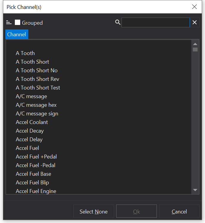
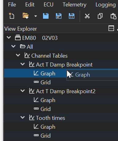
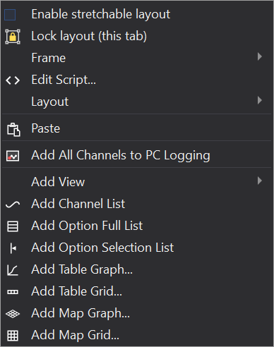
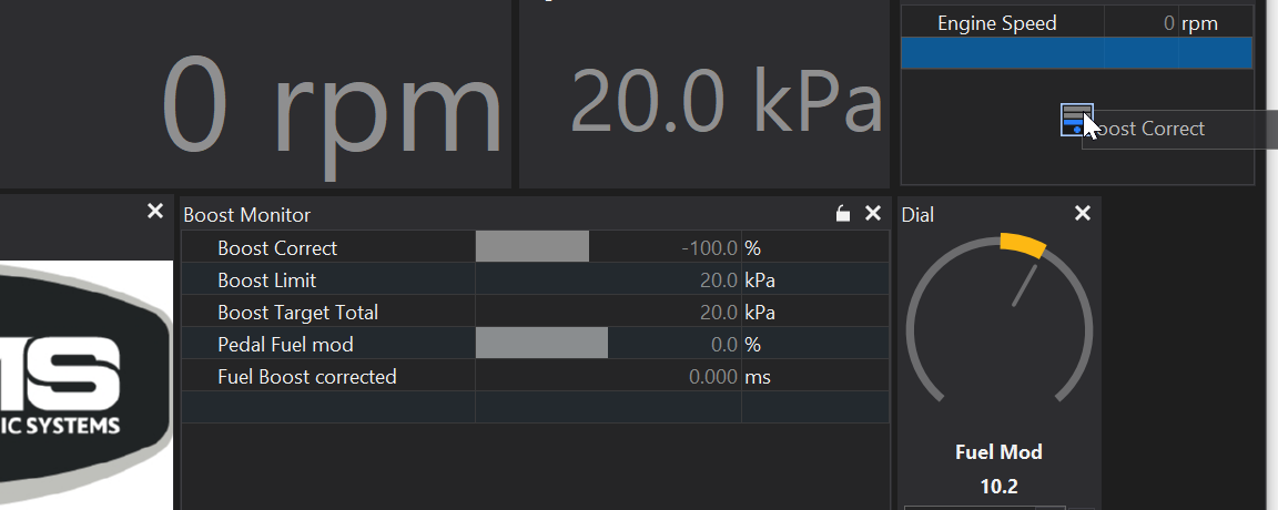
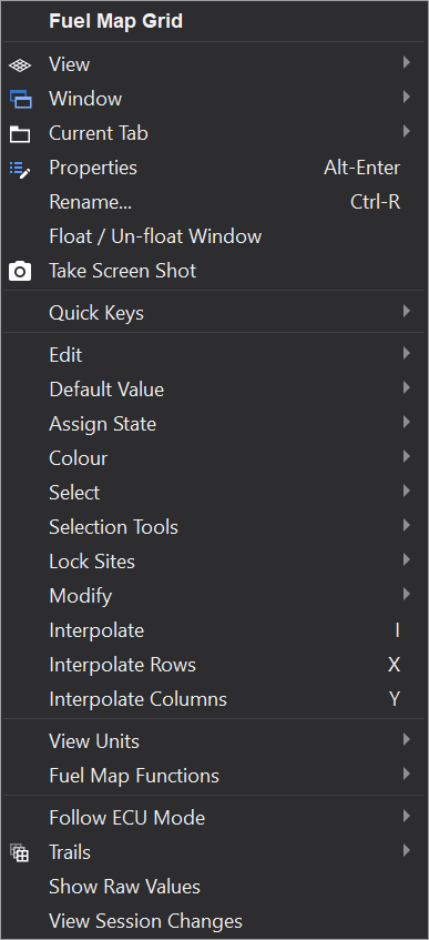

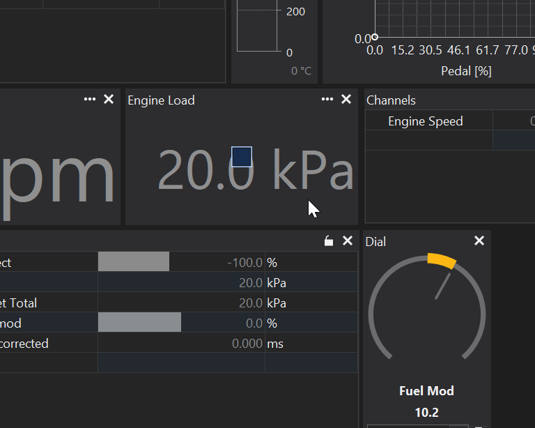
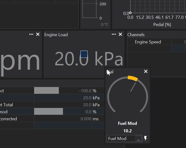
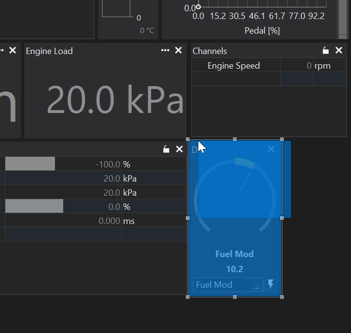
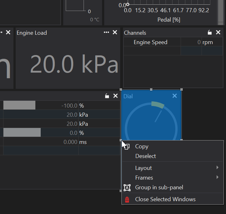
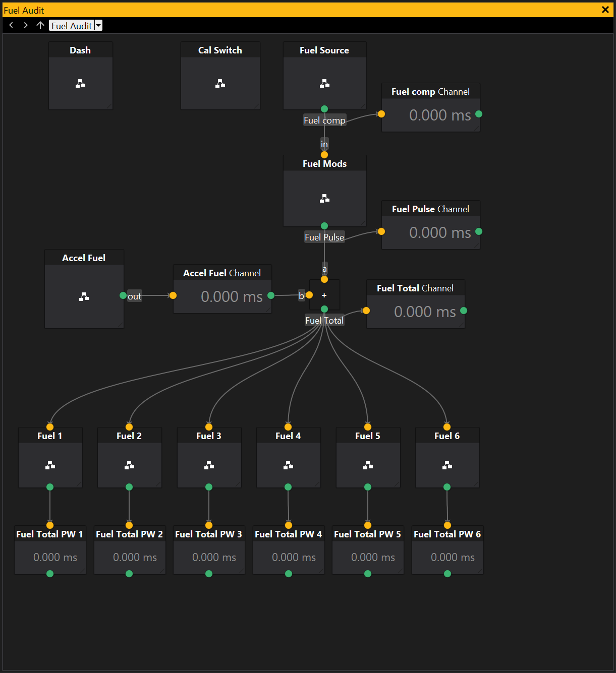
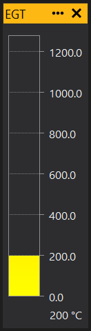
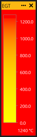
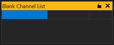
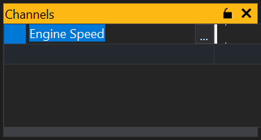
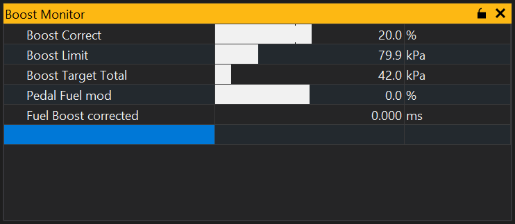
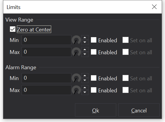
 in its title bar. This prevents items being added or removed from the list.
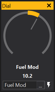

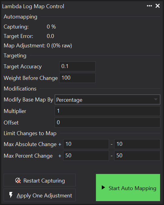

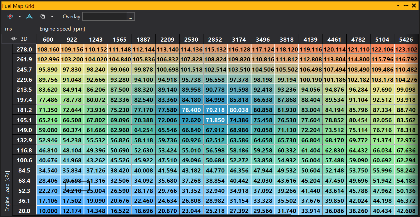
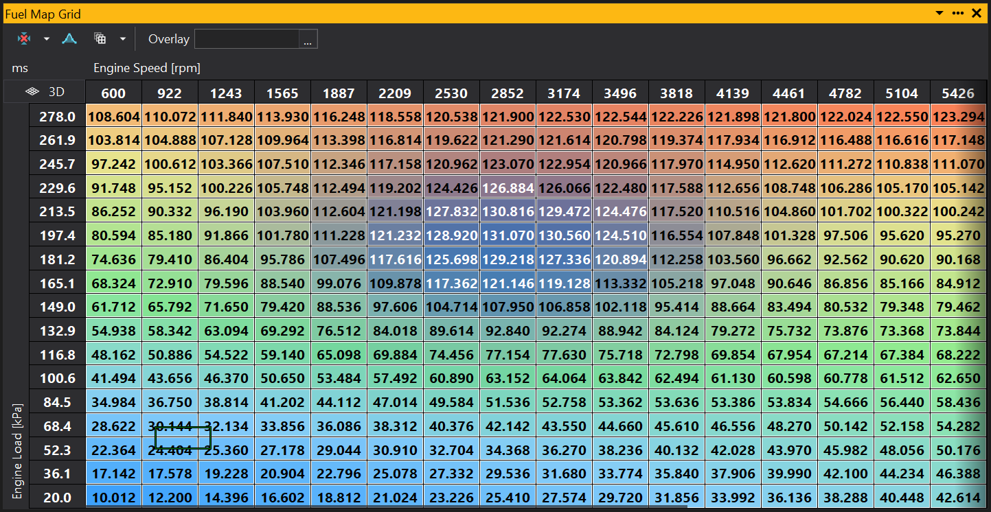
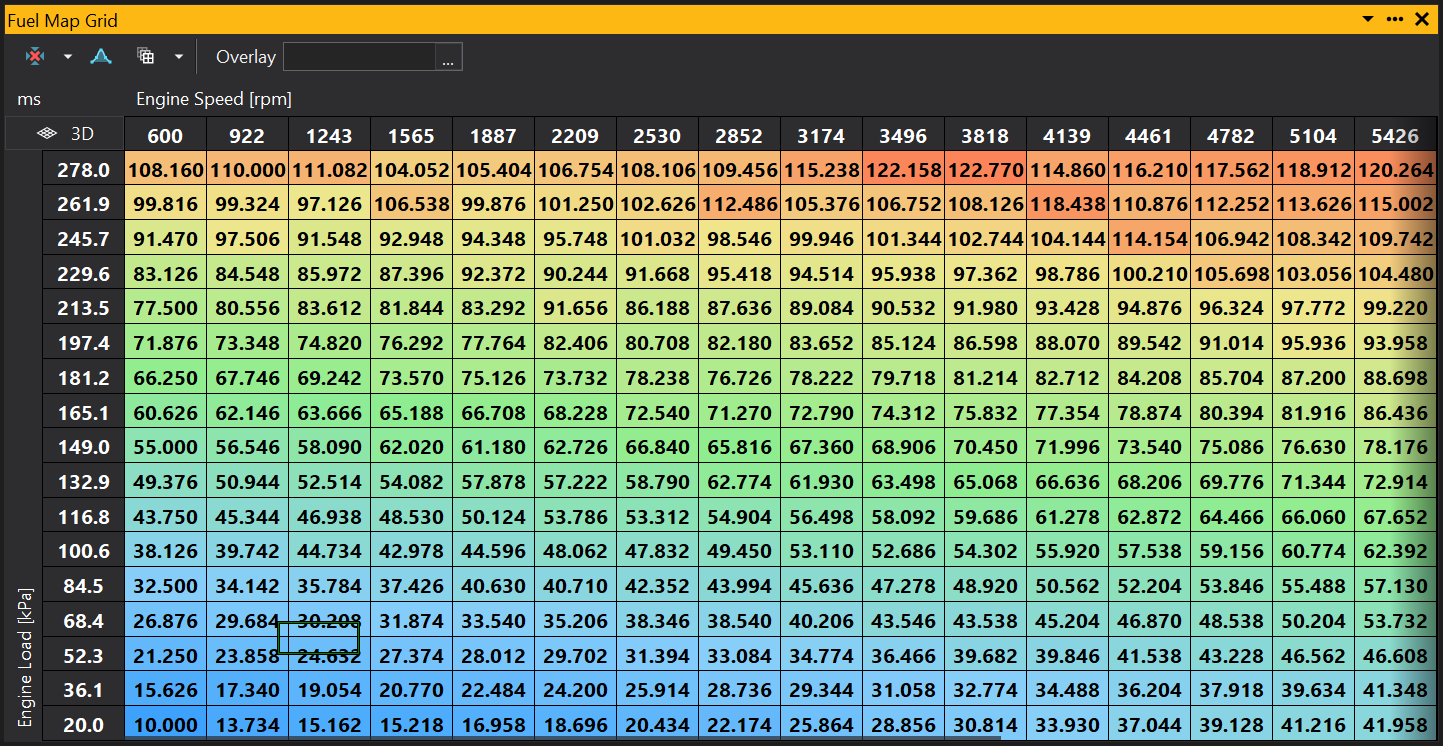

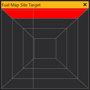
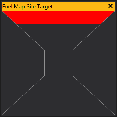
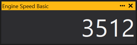
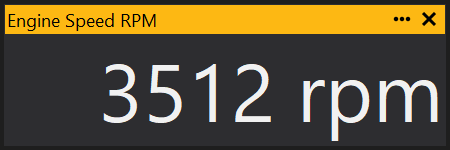
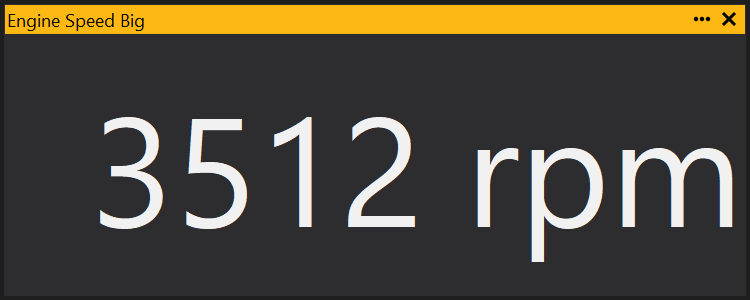
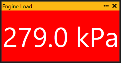
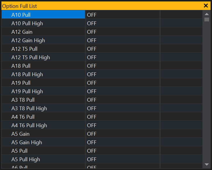
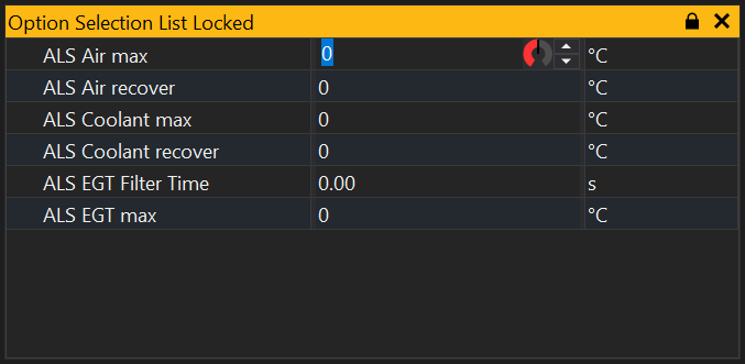
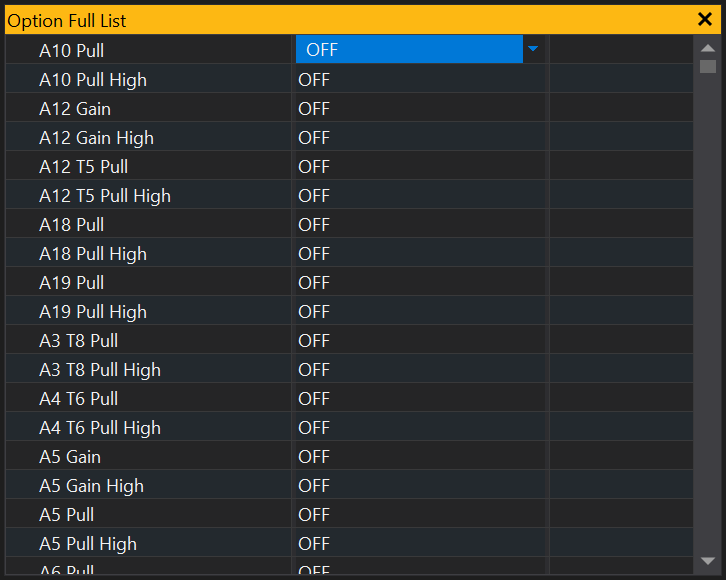
 icon on the left of the group. Click on it again to collapse the group.
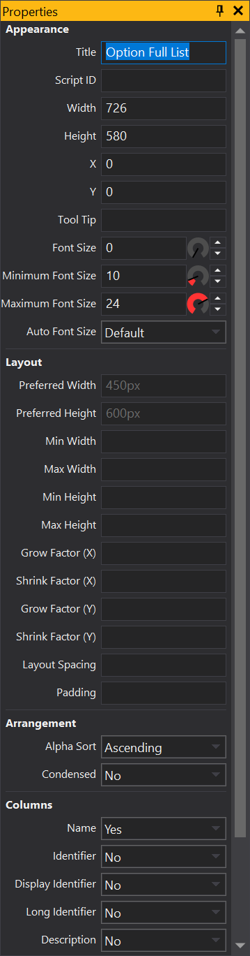
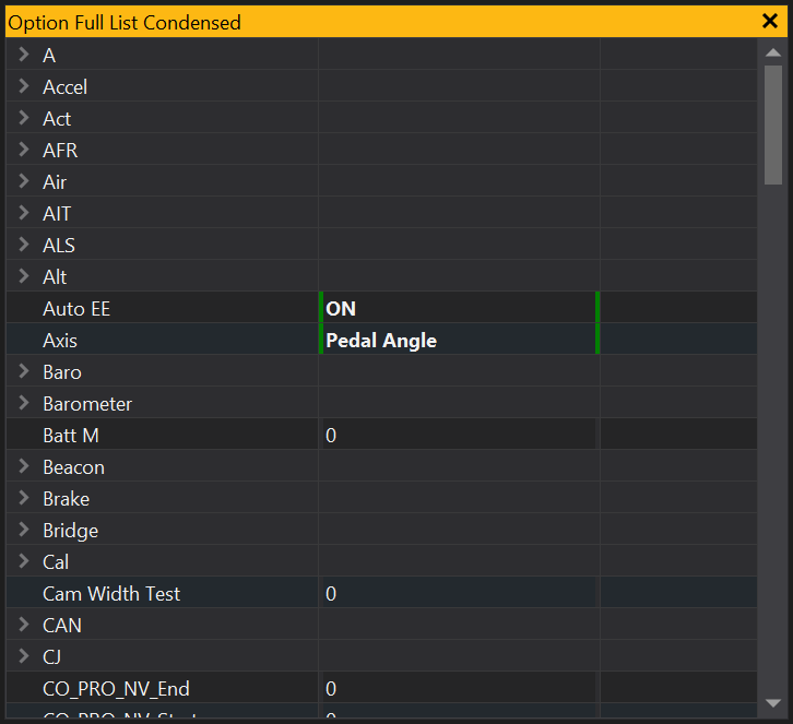
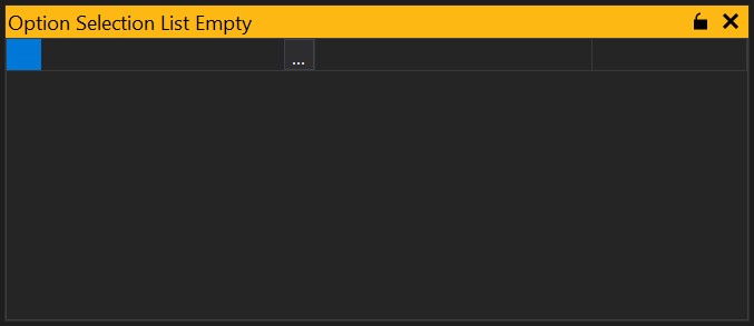
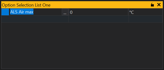
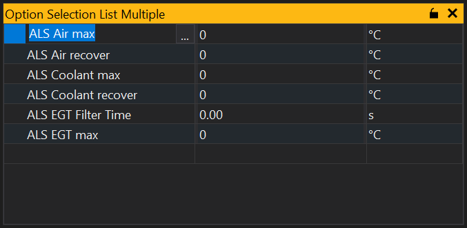
 button in the title bar. It is also possible to toggle locking from the context menu (right click).
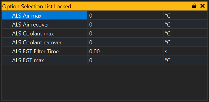
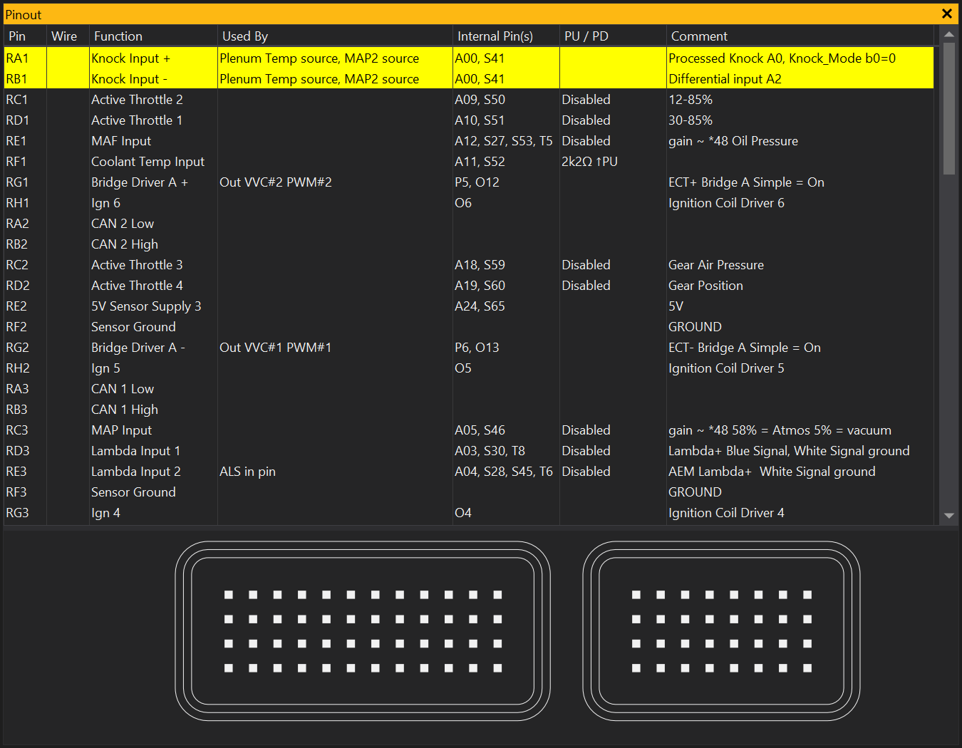
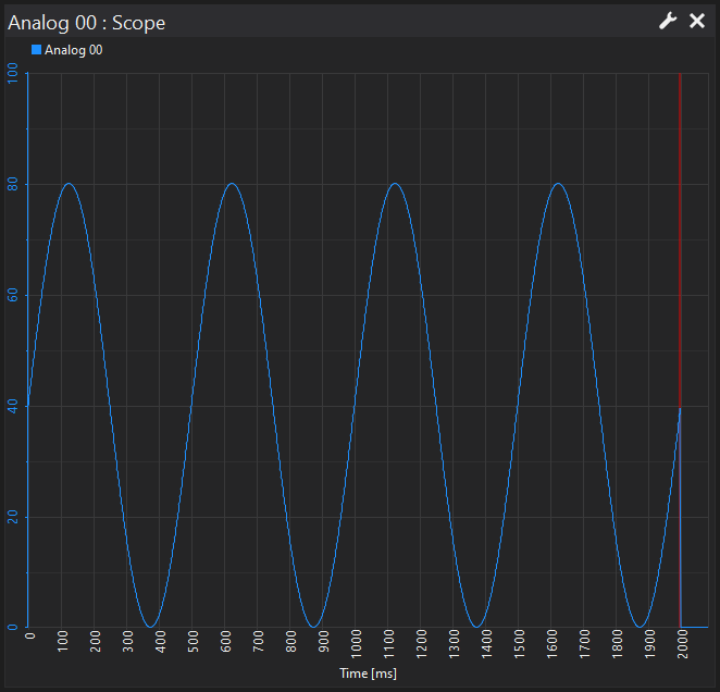
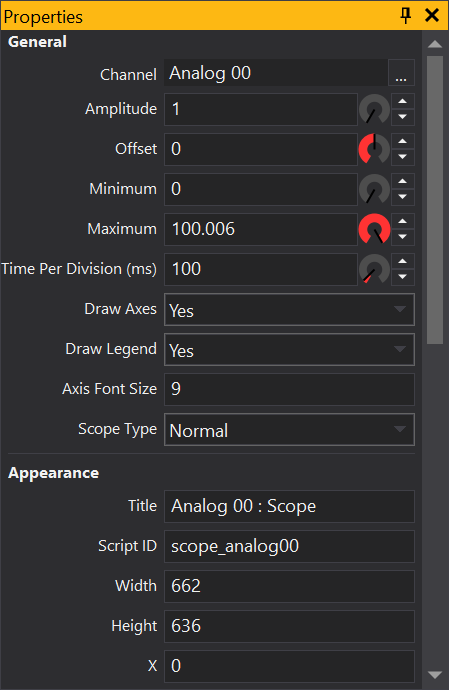
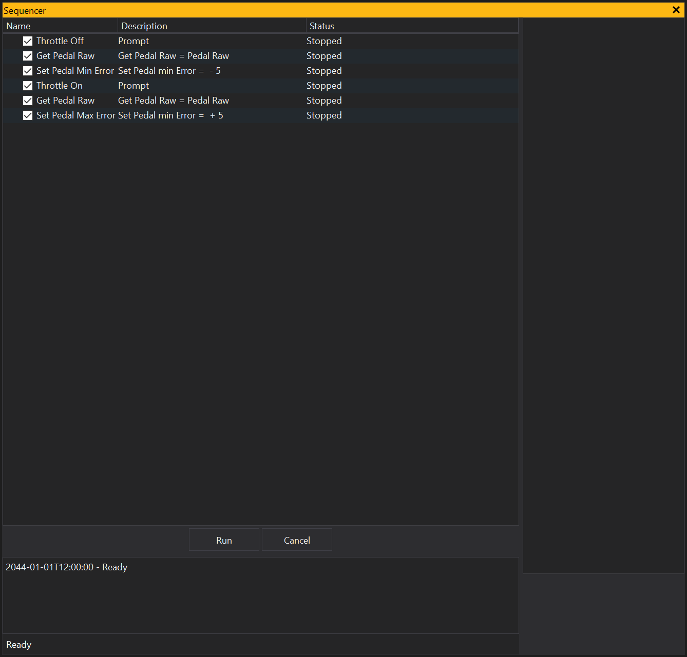
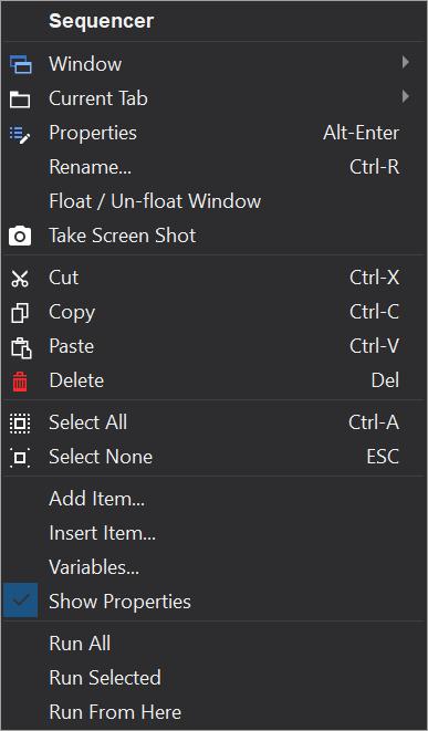
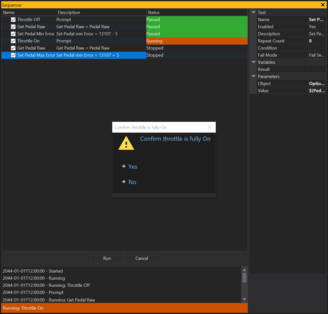
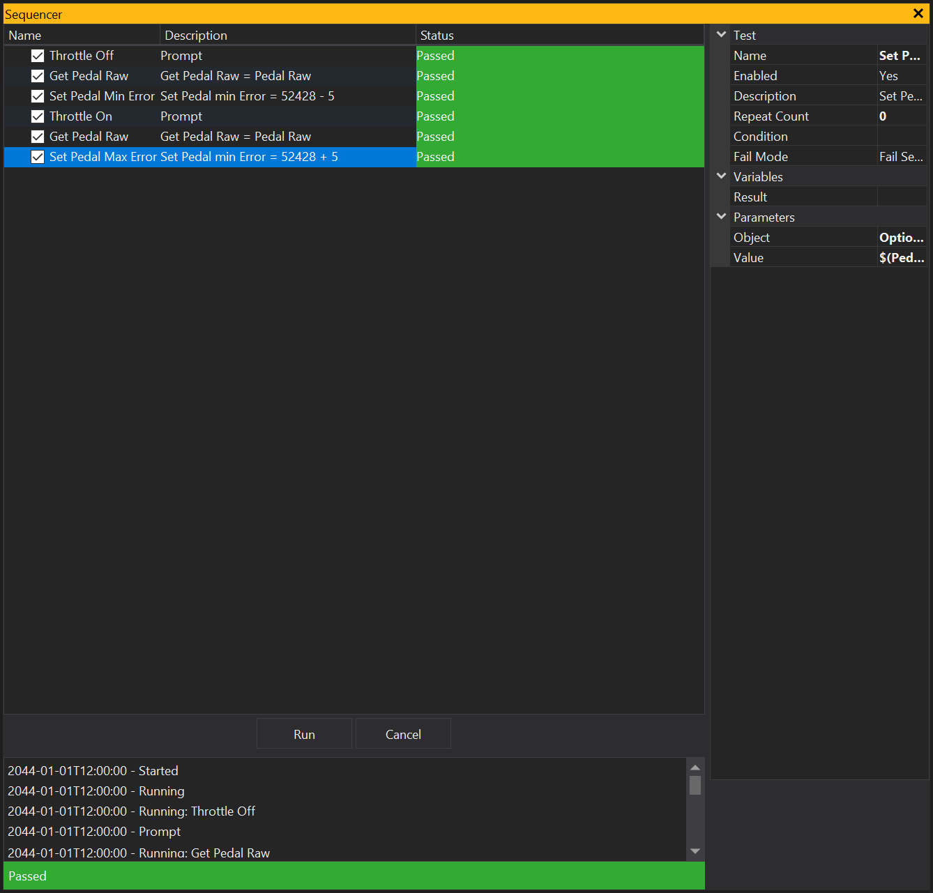
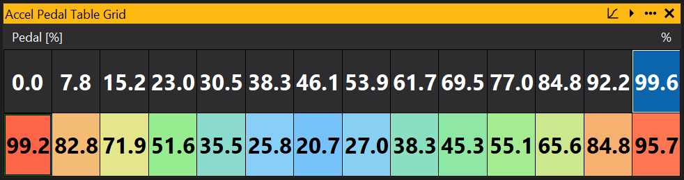

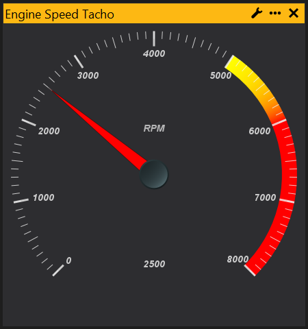
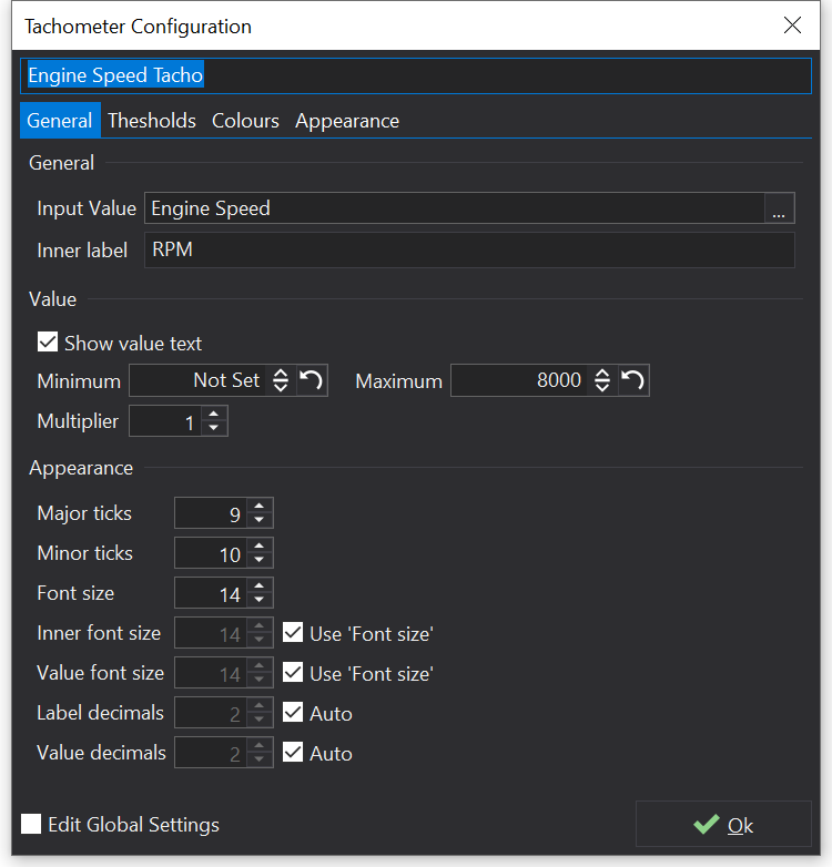
 button.
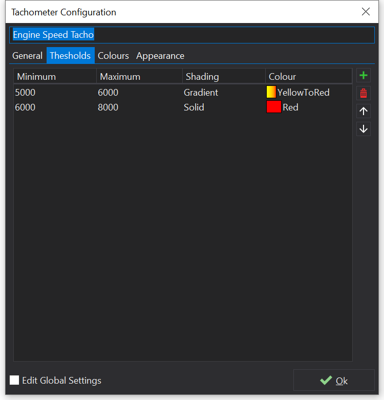
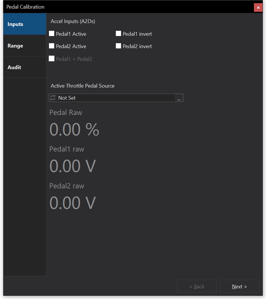
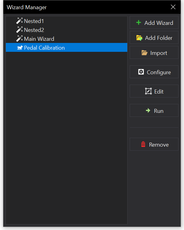
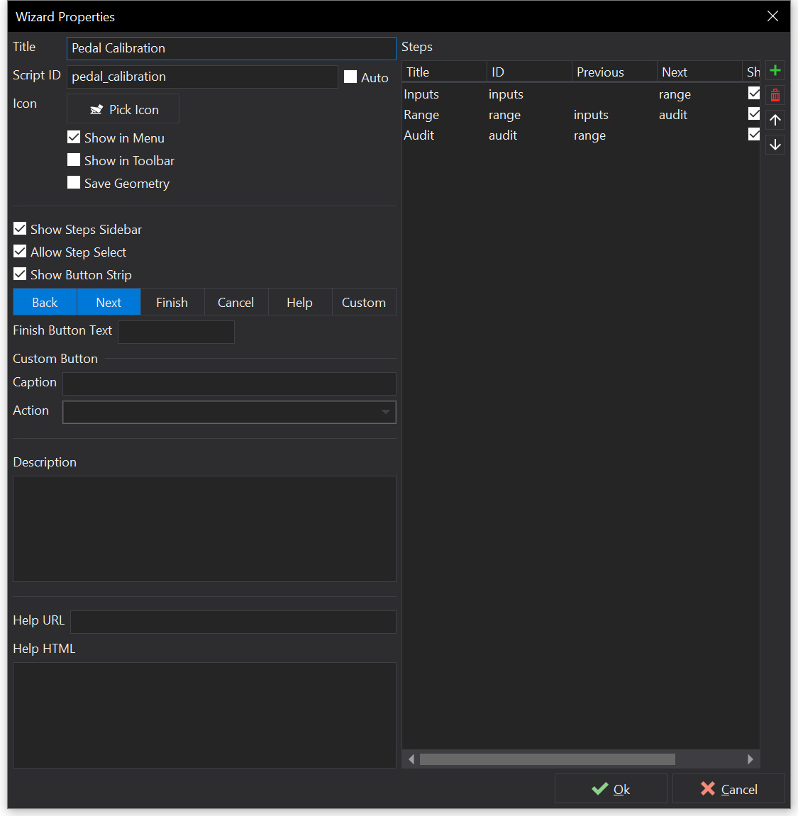
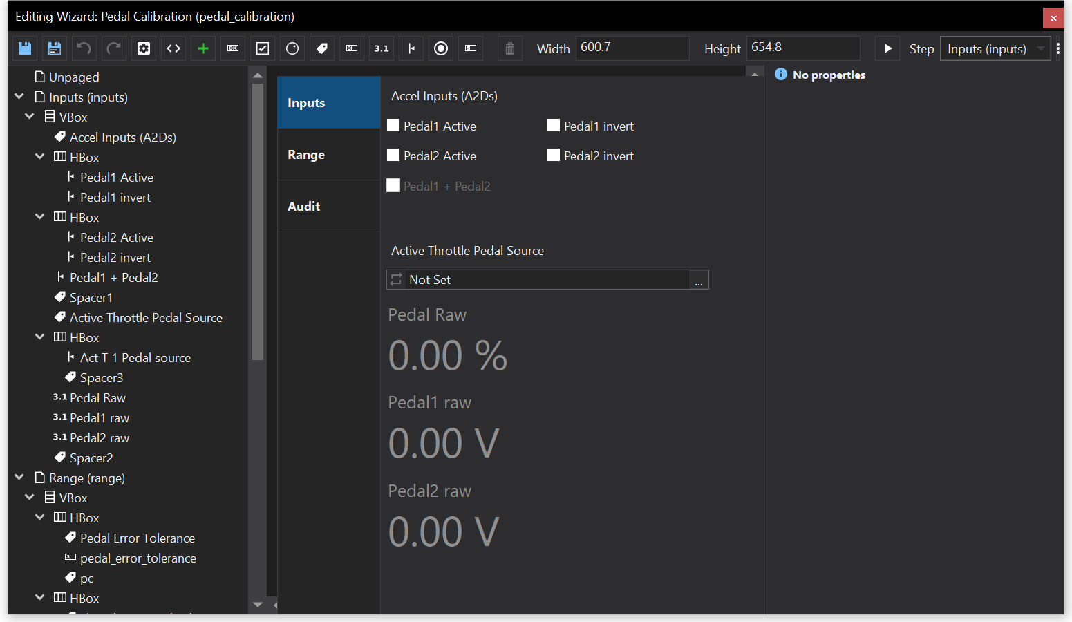
 button in the top left. This is where you will write code for the functionality of buttons, checkboxes and other elements you’ve added to your pages.