Map Grid
The map grid is a 2D representation of a map. It can be use to view and edit sites on the map as well as overlay other objects such as tables and log maps. Its displays the same data as the Map Graph and has much of the same functionality. For how to add objects see the Adding an Object section.
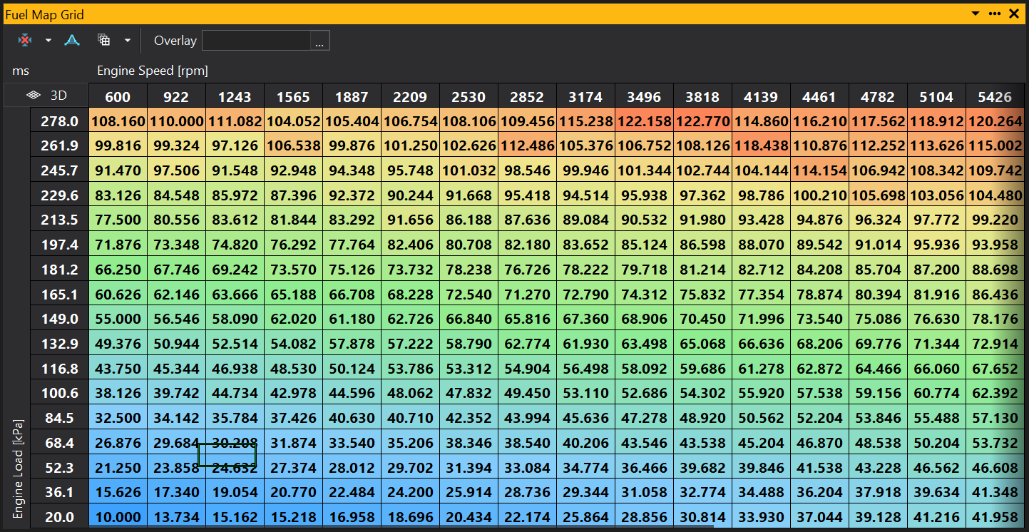
When the map grid has been added you will see something similar to the following:
Selecting and Editing the Map Grid
To select an area on the grid, you can either click and drag using the left mouse button, or use the arrow keys whilst holding down Shift. Once an area is selected holding the Ctrl button down then pressing the arrows keys, will shift the entire selected area in the direction selected.
To select two non-concurrent areas (i.e. at opposite sides of the grid without the positions in between), select an area then whilst holding the Ctrl key, use the left mouse button to select another area.
To edit a point or group of points selected on the grid, either just start typing a number to set the selected points to a specific value, or use the + and - keys to increment up or down. To increment by a larger amount, hold down the Shift key while using + and -.
When online, pressing the Space bar will select the site nearest to the current cursor site.
Displaying the State
By displaying the state of the values on the grid you can see which sites have been edited how they have been edited. To show the state of each site right click on the grid and select properties. From the Properties window set ‘Colour Mode’ to either ‘State’ or ‘State and Gradient’. Setting to ‘State’ will make each site display just its state colour, setting to ‘State and Gradient’ will display a colour for the site value and in the corner of each site display a separate colour for the sites state:
The default colour code for the states are as follows. These can be changed in Configure > Preferences and going to the calibration states in the colours section.
| Colour | Dark Mode | State | Description |
|---|---|---|---|
| White | Button Face | Unchanged | Has not been changed. |
| Yellow | Green | Changed | Site has been adjusted by the user. |
| Lime | Dark Cyan | Calibrated | This state can be set either manually by the user or when the site has been calibrated using log-mapping (auto mapping). |
| Green | Dodger Blue | Calculated | Site has been calculated by GWv4 using a function. |
| Grey | Slate Grey | Pasted | Site value as been copied from another map then pasted to the current site. |
| Blue | Medium Orchid | Optimised | Site has been set using the Optimise function. |
| Orange | Orange | Undone | No longer used since GWv4 4.03.25. You may see this state if the calibration was used with GWv3. |
| Red | Red | Bad | GWv4 4.03.25 can not determine the state of this site. It is recommended that you contact GEMS if you see the ‘Bad’ state on a map. |
Locking sites
Locking certain sites in the map can be useful so that accidental changes are not made to known good values. You can do this by right clicking on the grid and selecting ‘Lock Sites with Calibrated State’. When this is set any sites which have been set to calibrated can not be changed. You can also manually set states to being calibrated therefore locked, by right clicking on the grid and selecting State>‘Set State to Calibrated’. To unlock the site select State>‘Set State to unchanged’.
Changing the look of the Map Grid
It is possible to change the way the map grid looks in a multitude of ways. For instance you can remove the change the gradient colour, show sites that have been changed and display the current ECU position.
To change the colour of the map grid, from the Menu select: Configure > Preferences. In the preference window select the colours section. Find the option called ‘Map grid Fill’. From here you can select from many different gradients or create your own.
All other changes are made in the properties of the map grid. By default the properties window is displayed to the left of the workspace, if it is not shown you can right click on the map grid and select properties. The properties for the map grid will then be displayed. An explanation of each option is displayed at the bottom of the properties window, when the property is selected
For more on the properties window, see the Properties Window section.
Soft Selections
The amount of soft selection can be changed by using the selection range property of the map grip. For a full explanation of soft selection see the soft selections section of Map Graph.
Map Grid Functions
See section Map & Table Functions.
View Properties
Properties editable via the properties editor.
| Property | Script ID | Description |
|---|---|---|
| Object | object |
Name of the object displayed by this view. |
| Title | title |
The title of the window. |
| Script ID | id |
The scripting ID of the window. Can be used as an alternative to the title for searching for windows from scripts. |
| Tool Tip | tooltip |
Window tool tip. |
| Font Size | font_size |
Size of the text used in the grid. |
| Minimum Font Size | min_font_size |
Minimum size of the text used in the grid with auto font size. |
| Auto Font Size | auto_font_size |
Automatically determine the font size based on the size of the grid. |
| Text Align | text_align |
Automatically determine the font size based on the size of the grid. |
| Stretch Axes | stretch_axes |
Automatically determine the font size based on the size of the grid. |
| Min Cell Width | min_cell_w |
Cell size control. |
| Min Cell Height | min_cell_h |
Cell size control. |
| Max Cell Width | max_cell_w |
Cell size control. |
| Max Cell Height | max_cell_h |
Cell size control. |
| Colour Mode | colour_mode |
Control how colours are displayed for this object. |
| Auto Text Contrast | auto_text_contrast |
Picks an appropriate text colour based upon the background colour automatically. |
| Position Box | position_box |
Box displaying the current site location when online. |
| Show Trails | motion_trails |
Display trails of where the site position has been over time when online. |
| Trail Time [s] | motion_trail_time |
Time that motion trails display for when online, in seconds. |
| Trails Infinite Time | motion_trail_infinite |
Motion trails set to infinite time. |
| Link Selection | link_selection |
Links the selection with views of the same object (e.g. links the selection on map grid and graph views). |
| Selected | selected |
Selected sites. |
| Soft Selection Range | range |
Sets the 'soft' range of partially selected points. |
| Follow ECU Mode | follow_mode |
Follows the current site with the selection. |
| Small Increment | increment_small |
Sets the small increment / decrement value for keyboard control with '[' and ']' keys. |
| Large Increment | increment_large |
Sets the large increment / decrement value for keyboard control with Shift-'[' and Shift-']' keys. |
| Is Scaled Increment | increment_real |
If set to 'Yes', uses the small/large increment to increment the scaled (real) value rather than the raw integer value. |
| Decimal Places | decimal_places |
Overrides automatic decimal places. |
| Swap X and Y | swap_xy |
Swaps X and Y axes. |
| Invert X | invert_x |
Inverts the X axis. |
| Invert Y | invert_y |
Inverts the Y axis. |
| Fill Gradient | gradient_fill |
Gradient used for the fill depending upon value |
| Axis Gradient | gradient_axis |
Gradient used for the axis fill depending upon value |
| Overlay | overlay |
Selects an object to overlay colour on the grid. |
| Range Mode | range_mode |
Changes the axis scale limits: Preferred: Equivalent to 'Auto'. None: Uses the full range. Auto: Scales to fit. Fixed: The default value, fixed at the range defined in the GIN file, or the full range if not defined. User: User defined minimum and maximum. |
| Minimum | range_min |
Minimum for user defined range. Range Mode must be set to "User". |
| Maximum | range_max |
Maximum for user defined range. Range Mode must be set to "User". |