Design Tab

Overview

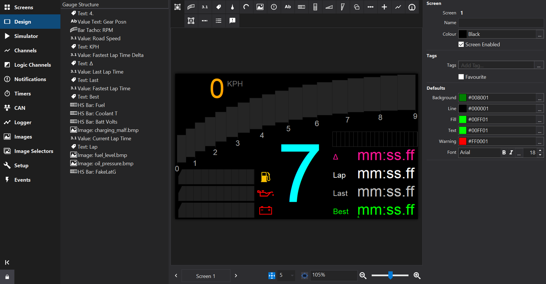
The Design Tab is used to configure a Screen (commonly referred to as a Page).

Design Tab Design Tab

Gauge Structure Tree

Displays a tree that describes the layout of the screen.

Gauges may be grouped together and appear as an item in the gauge structure list with child gauges within the next level of the tree. Grouped gauges may be collectively positioned and their properties may be collectively edited.

Items may be selected by clicking. Hold the Shift key to select a range of items and the Ctrl key to add/remove single items from the selection.

The Gauge Structure Tree indicates the Z-order, with items at the top of the list being rendered ‘below’ items further down the list.

The Z-order may be modified by dragging items in the Gauge Structure Tree to the desired position.

Design Area

In the center of the Design Tab is the Design Area. This shows an interactive visual representation of the screen layout.

Gauge Palette

At the top of the design area is the Gauge Palette from which new gauges may be added to the screen design.

Properties

To the right of the Design Area are the Properties. The list of properties changes in depending upon the selection in the Design Area.

The properties may be edited to adjust the visual appearance, input channel(s) and behaviour of screens and gauges.

If no gauges are selected then the properties of the screen itself are displayed.

Multiple gauges may be selected by click & drag in the Design Area or by selecting items in the Gauge Structure tree.

When multiple gauges are selected, their Properties are merged and can be collectively edited to apply the same changes to all gauges in the selection.

View Controls

At the bottom of the Design Area are several controls:

Screen Selector

Click the Screen button to pop up a list of screens similar to the Screens Tab to allow quick switching between screens. On the left and right are arrow buttons to move to the next/prior screen.

Snap To Grid

The Snap To Grid Snap toggle button enables grid snapping so that gauges can be more easily positioned on a regularly spaced grid. To the right of the Snap button, the grid spacing may be selected.

Display Scaling

To the right of the View Controls is a zoom slider which can be used to zoom-in on the screen for more precise positioning of gauges.

The zoom level is displayed as a percentage and may be entered in as a number using the keyboard.

The Fit Screen To Window Fit button may be checked to automatically set the zoom level so that the screen fills the Design Area.

Subsections of Design Tab

Standard Gauge Properties

Overview

Most gauges share a standard set of gauge properties described below. In addition to these standard properties, many gauges have additional properties that are described in their relevant section.

Standard Properties

The standard gauge properties are as follows:

Property Description
Name The name is used to identify the gauge. Dash Design assigns a name to a new gauge automatically. The gauge is also automatically renamed when changing the gauge text for Text Label gauges or changing the Input for all other gauges. This makes it easy to identify the purpose of a gauge in any lists or editors.
Input The output used by the gauge.
Minimum The value at which a gauge starts, for example the start value of a bar gauge.
Maximum The value at which a gauge finishes, for example the end value of a bar gauge.
Resolution The resolution of the bar or tacho gauge. This is the value change that will move the bar or tacho to the next segment.
Label Frequency Labels are drawn at every Label Frequency multiplied by the resolution.
Font The font used by the gauge. See Font Editor . The Font property also allows changing the size and style of the font in-place.
Format Determines how numbers are formatted in the gauge. See the Value Formatting section for more information.
Special Format Displays internal system values. See the Value Formatting section for more information.
Left The left most (x) position of the gauge.
Top The top most (y) position of the gauge.
Width The width of the gauge. Some gauges are sized implicitly on their contents in which case the Width property will not be available.
Height The height of the gauge. Some gauges are sized implicitly on their contents in which case the Height property will not be available.
Background Colour of the gauge background.
Line Colour of the graticules and/or outline of the gauge.
Fill Colour in which to draw a filled part of the gauge, for example the part of a bar graph that has data.
Text Colour of all text in the gauge.

Value Formatting

Format Gauge Property

Many gauges can use a Format property in order to control how values are displayed.

The following table shows the standard formatting characters that can be used:

Character Description Notes
X or x Display in hexadecimal Must be first character in format
B or b Display in binary Must be first character in format
- Force leading sign character e.g. +5.3 is displayed instead of 5.3
# Indicates an optional digit e.g. ### gives 93
9 Indicates a required digit e.g. 999 gives 093
5 Indicates rounding to the nearest 5 e.g. ##5# gives 2450 instead of 2448
0 Indicates rounding to the nearest 10 e.g. ##0# gives 2400 instead of 2448
. Indicates position of decimal place

Time Formats

Gauges using time outputs use a different set of format strings:

Character Description
H Displays the hours in 24 hour format.
h Displays the hours in 12 hour format.
m Displays the minutes.
M Displays the total minutes (including hours) if there is no preceding h or H in the format string.
s Displays the seconds.
S Displays the total seconds (including hours and minutes) if there is no preceding m or M in the format string.
f Displays tenths of seconds.
ff Displays hundredths of seconds.
fff Displays thousandths of seconds (only works for lap time via CAN).
y Displays the date in dd-mm-yy format
z Displays the date with text for the month, eg 01 Jan 09

Example Time Formats

Format Output Example
Hms 24:00:00
hmsf 12:00:00.0
hmsff 12:00:00.00
y 01-01-09
hmsz 12:00:00 01 Jan 09

For an example of the total minutes or total seconds formatting (typically used with stopwatches or lap times) consider a stopwatch at 1h02m03s.45. The following results can be obtained:

Format Output Example
hmsf 01:02:03.45
msf 02:03.45
Msf 62:03.45
sf 03.45
Sf 3723.45

Special Formats / System Information

System information can be shown by adding a value gauge to the screen and setting the Format property as follows:

Special Format Format Description
Serial Number vs Shows the serial number of the display.
Version Number vv Shows the version of the colour display firmware.
Setup Name vz Shows the setup name, if set. See Setup Name .
Log Support vl Shows the logger status (see below).
Usage Hours vu Shows the usage (on time) of the display in hours.
Reset Count vr Shows the reset counter - the number of power on events since the last setup upload.
File Name vc Shows the filename of the setup file used to program the display (up to 24 characters).
Frame Rate va Shows the number of times the screen is being refreshed per second (frames per second), in the form “fps:xx”.
Processor Speed vp Shows the CPU clock speed / Memory Bus Speed. Not available on all displays."
FRAM Size vf Shows the size of the Ferromagnetic RAM as “FRAM xxxKb”.
PCB Serial vg Shows the serial number of the PCB, which may differ from Serial Number. Not supported by all display types.
Network Status vn For ethernet enabled displays, shows the network status. IP address (e.g. NET 192.168.0.99), if connected.

Other possible values:
  • NET Initialising
  • NET ERROR
  • NET Link Down
  • NET {ip address}
  • NET UNKNOWN
Client Network Status vnc For ethernet enabled displays, indicates if a client is connected over the network. e.g. NET NO CLIENT when no client connection, NET CLIENT 192.168.0.30 when there is an active client TCP connection.
Channel Name @channel Shows the name of the selected input channel. When used on a Value Gauge , Dash Design will replace the gauge with a static label. This can be useful in gauge groups where a label should show the channel name used by a value.
Channel Units @units Shows the units of the selected input channel. When used on a Value Gauge , Dash Design will replace the gauge with a static label. This can be useful in gauge groups where a label should show the channel units used by a value.

Log Support (Logger Status)

Logging Status Description
Logging not Supported This firmware does not support logging.
Logging Stopped The device is not currently logging.
Logging Running The device is currently logging.
Log Looped The log has looped.
Log Memory Space Low There is less than 5 % of the memory remaining.
Log Memory Full The logging memory is full and logging has stopped.
Log Initializing The logger is currently processing the setup.
Log Setup Error There is a problem with the logger setup.
Log Overrun Reduce the # of channels or the screen complexity.
Log Memory Worn Flash worn, Log will continue at reduced capacity.

Gauge Z-Order

Overview

The gauges on a screen are drawn (rendered) in a specific order. If gauges overlap then the gauge that was drawn first will be overdrawn by the next one. This ordering is referred to as the Z-order.

If the horizontal position of gauges is considered to be the X-axis and the vertical position the Y-axis, then the Z-axis is the depth (i.e. drawing order).

Changing the Z-Order

The Z order can be changed using menu commands and by using the Gauge Structure Tree.

Using menu commands

Command Description
Edit | Bring Forward Moves the selected gauge(s) forward (drawn later) by 1 step
Edit | Send Back Moves the selected gauge(s) backward (drawn earlier) by 1 step
Edit | Bring to Front Moves the selected gauge(s) forward as far as possible (drawn last)
Edit | Send to Back Moves the selected gauge(s) backward as far as possible (drawn first)
Tip

If frequently using these commands, custom keyboard shortcuts may be assigned to them.

Using the Gauge Structure Tree

The Gauge Structure Tree indicates the Z-order, with items at the top of the list being rendered ‘below’ items further down the list.

The Z-order may be modified by dragging items in the Gauge Structure Tree to the desired position.

Gauge Groups

Overview

Gauge Icon Gauges may be grouped together so that they are collectively edited as a group.

Creating Gauge Groups

Select gauges in the Design Area or in the Gauge Structure Tree, either use the right-click context menu or the command Edit | Group Ctrl + G.

Groups may be ungrouped using the command Edit | Ungroup Ctrl + Shift + G.

Properties

The properties of groups are merged from the gauges within the group and edited collectively.

Tip

Use Value Gauge with special formats to display the input Channel Name / Channel Units specified on the group.

Gauges

Overview

Gauges are the visual elements of a screen page. The various different gauge types available in Dash Design are described in this section.

Gauge Types

Gauge Support Matrix

GaugeCD34LDS4CD32LDS35LDS35_LCD6-43GLW-43
Tacho Gauges Yes Yes Yes Yes Yes Yes Yes
Value Gauge Yes Yes Yes Yes Yes Yes Yes
Label Gauge Yes Yes Yes Yes Yes Yes Yes
Needle Gauge Yes Yes Yes Yes Yes Yes Yes
Image Gauge Yes Yes Yes Yes Yes Yes Yes
Animation Gauge Yes No Yes No No Yes No
Warning Gauge Yes Yes Yes Yes Yes Yes Yes
Text Input Gauge Yes Yes Yes Yes Yes Yes Yes
Bar Gauges Yes Yes Yes Yes Yes Yes Yes
Shape Gauge Yes Yes Yes Yes Yes Yes Yes
Limiter Gauge Yes Yes Yes Yes Yes Yes Yes
Cross-Hair Gauge Yes Yes Yes Yes Yes Yes Yes
Graph Gauge Yes Yes Yes Yes Yes Yes Yes
Gauge Groups Yes Yes Yes Yes Yes Yes Yes
Bit Gauge Yes Yes Yes Yes Yes Yes Yes
Menu Gauge Yes Yes Yes Yes Yes Yes Yes
Text Message Gauge Yes Yes Yes No No Yes Yes
Arc Gauge No Yes No No No Yes Yes
Camera Gauge No No Yes No No No No

Subsections of Gauges

Animation Gauge

Overview

Gauge Icon Animation Gauges may be configured to display an animated gif image.

Animation gauges might be used to display a short animated splash screen when the display is switched on.

Display Support

DisplaySupported?
CD34 Yes
LDS4 No
CD32 Yes
LDS35 No
LDS35_L No
CD6-43 Yes
GLW-43 No

Arc Gauge

Overview

Gauge Icon The Arc Gauge renders an swept arc (annulus). As with Needle Gauge , the arc gauge can specify a background image.

Note

The arc gauge may require a firmware update to be supported on your display.

Properties

In addition to Standard Gauge Properties , the following properties may be configured:

Property Description
Type The type of gauge to be drawn, may be switched between Needle Gauge or Arc Gauge .
Background bitmap The background gauge image. Clicking the Clear button clears the background bitmap.
Auto Size Automatically calculate the radii and centre of the arc from the gauge width / height.
X Centre, Y Centre The centre of the gauge from which the logical centre of the pointer will be drawn.
Outer Radius Outer radius of the arc.
Inner Radius Inner radius of the arc.
Thickness Thickness of the arc (Outer Radius - Innter Radius).
Start Degrees The number of degrees from 6 o’clock (the zero degree position) that the starting value of the gauge should be drawn.
End Degrees The number of degrees from 6 o’clock (the zero degree position) that the end value of the gauge should be drawn.
Transparent box If checked, then any colour in the background bitmap that matches the colour specified in Transparent Colour will not be drawn. This is useful when overlaying a round tacho bitmap gauge over another bitmap.

Display Support

DisplaySupported?
CD34 No
LDS4 Yes
CD32 No
LDS35 No
LDS35_L No
CD6-43 Yes
GLW-43 Yes

Bar Gauges

Overview

There are 4 types of bar gauge - rectangle and triangle shaped bars in either horizontal or vertical orientation:

  • Gauge Icon Vertical Triangular
  • Gauge Icon Horizontal Triangular
  • Gauge Icon Vertical Rectangular
  • Gauge Icon Horizontal Rectangular

Segments

A bar contains a number of segments that divide the bar up between the minimum and maximum limits.

Properties

In addition to Standard Gauge Properties , the following properties may be configured:

Property Description
Separators Between Bars If checked, a separator line is drawn between each bar in the line colour. Otherwise, the bars run contiguously.
Fill Bar From Centre (Rectangular Bars) If checked, the bar is drawn from the centre. For example, consider a bar gauge with the minimum set to -2 and the maximum set to +2, with Fill From Centre checked. If the value of the input is -2, the bar will be filled from the midpoint (0) to the left hand side. If the input is 0, the bar will be unfilled. If the input is 2, the bar will be filled from the midpoint to the right hand side.
Display Value As Single Line (Rectangular Bars) If checked, then the bar will not be filled. instead a single line will move across the bar indicating the current value.
Square Mode (Rectangular Bars) If checked, then the bar will not have a chamfer at one end.

Display Support

DisplaySupported?
CD34 Yes
LDS4 Yes
CD32 Yes
LDS35 Yes
LDS35_L Yes
CD6-43 Yes
GLW-43 Yes

Bit Gauge

Overview

Gauge Icon The Bit Gauge displays the value of individual bits in the integer representation of the input channel value.

Properties

In addition to Standard Gauge Properties , the following properties may be configured:

Property Description
On The colour of bit elements for bits that are set in the input value.
Off The colour of bit elements for bits that are not set in the input value.
Spacing Spacing, in pixels, between bit elements in the gauge.
Box Width Width, in pixels, of bit elements in the gauge.
Box Height Height, in pixels, of bit elements in the gauge.
Corner Radius If non-zero, draws bit elements as rounded rectangles with the given corner radius, in pixels
Circle Style Render bit elements as circles.
Direction Controls the direction in which bit elements are drawn.
Bit Count The number of bit elements to render.
Items Lists the bit elements and allows arbitrary bits from the input value to be assigned to specific bit elements.

Display Support

DisplaySupported?
CD34 Yes
LDS4 Yes
CD32 Yes
LDS35 Yes
LDS35_L Yes
CD6-43 Yes
GLW-43 Yes

Camera Gauge

Overview

Gauge Icon Camera Gauges are used to show the video feed from an attached camera on the display.

If no camera is connected, a standard colour bar test card is shown.

Properties

In addition to Standard Gauge Properties , the following properties may be configured:

Property Description
Mirror Image from Camera If checked, the feed from the camera will be reversed as if seen in a mirror. This is useful when a non-mirrored camera is used as a rear view camera.
Display Mode Sets the display mode of the image. This can be one of three modes:
  • Preserve Aspect Ratio - The width and height of the gauge will be adjusted such that the aspect ratio (width / height) of the original camera source is preserved.
  • Crop - Allows any gauge size to be set. Because the aspect ratio of the camera is fixed, depending on the size of the gauge, some of the vertical or horizontal image will be cropped from the camera.
  • Scale - Allows any gauge size to be set. The image from the camera will be scaled in both width and height to fit the gauge size without cropping. The image may be distorted as a result.
Left Crop Number of pixels to crop from left.
Top Crop Number of pixels to crop from top.
Right Crop Number of pixels to crop from right.
Bottom Crop Number of pixels to crop from bottom.

Display Support

DisplaySupported?
CD34 No
LDS4 No
CD32 Yes
LDS35 No
LDS35_L No
CD6-43 No
GLW-43 No

Cross-Hair Gauge

Overview

Gauge Icon The Cross Hair Gauge uses two inputs to move a cross hair around a box.

Properties

In addition to Standard Gauge Properties , the following properties may be configured:

Property Description
XInput, YInput Specify the inputs for the X and Y axes of the gauge.
X Minimum, Y Minimum Specify the starting values for the X and Y axes.
X Maximum, Y Maximum Specify the end values for the X and Y axes.
Cursor Size Is the size of the cross hair cursor.
Cursor Shape Different shapes may be selected for the cursor.
Cursor Thickness Controls the thickness of lines used to draw the cursor.
Background Bitmap Can be used to specify a bitmap that will be shown behind the cross hairs. This can be used to clarify the meaning of a particular position for the cross hair. Clicking the Clear button clears the background bitmap.
Transparent box If checked, then any colour in the background bitmap that matches the colour specified in Transparent Colour will not be drawn. This is useful when overlaying a cross hair gauge with a bitmap over another bitmap.

Display Support

DisplaySupported?
CD34 Yes
LDS4 Yes
CD32 Yes
LDS35 Yes
LDS35_L Yes
CD6-43 Yes
GLW-43 Yes

File Explorer Gauge

Overview

Gauge Icon The File Explorer Gauge provides access to files on the Display Module if supported. Some display types allow video playback and display of images from files via the file explorer.

Properties

In addition to Standard Gauge Properties , the following properties may be configured:

Title Tip
Up Button Input for Up button (scrolls file explorer selection).
Down Button Input for Down button (scrolls file explorer selection).
OK Button Input for OK button (accept selection).
Context Button Input for Context ‘menu’ / file management button.
Video Seek Offset Input for video seek offset.
Repeat Interval [ms] Auto-repeat interval for button inputs, set to zero for no auto-repeat.
Video Seek Interval [s] Jump length when seeking during video playback
Caption Title of the file explorer.
Line Spacing Spacing between lines in the menu.
Selected Fill Background colour of selected items
Font Font for normal items in the file explorer.
Text Colour Colour of normal items in the file explorer.
Selected Font Font for selected items in the file explorer.
Selected Text Colour Text colour of selected items in the file explorer.
Unsupported Text Colour Text colour of unsupported items in the file explorer.

Display Support

DisplaySupported?
CD34 No
LDS4 No
CD32 No
LDS35 No
LDS35_L No
CD6-43 No
GLW-43 No

Graph Gauge

Overview

Gauge Icon The Graph Gauge plots values from its input channel(s) with respect to time.

Properties

In addition to Standard Gauge Properties , the following properties may be configured:

Property Description
Time Base This is the width of the x axis in seconds. When a page with a historical graph gauge is first selected, the data is drawn from the left hand side of the graph (t=0). As the time progresses, the lines progress towards the right hand side of the graph. Once t = time base, the graph scrolls to the left to make more space available for drawing the lines.
Input Count The number of lines (outputs) drawn in this graph. Changing the input count will add multiple sets of properties for each line.
Input The output for which the line is drawn.
Colour The colour of the line.
Minimum Specifies the lower range of the y axis of the graph for this line. If the value of the output for this line falls below this value, the line will be drawn at the minimum value.
Maximum Specifies the upper range of the y axis of the graph for this line. If the value of the output for this line exceeds this value, the line will be drawn at the maximum value.

Display Support

DisplaySupported?
CD34 Yes
LDS4 Yes
CD32 Yes
LDS35 Yes
LDS35_L Yes
CD6-43 Yes
GLW-43 Yes

Image Gauge

Overview

Gauge Icon Image Gauges are used to show an image from a file or the output of a image selector output (See Image Selectors Tab ).

Properties

The Graphic/Input property allows a file to be selected from disk using the Open button.

Use the … button to select from all Image and Image Selector assets in the setup.

Use the Reload Reload button to update / reload the selected image asset from disk.

Use the Reload Clear button to un-set the selected image. This will not remove the associated image asset from the setup. To remove image assets, see Images Tab

When loading an image, if it is too large to fit on the screen, the option to resize it will be offered.

Display Support

DisplaySupported?
CD34 Yes
LDS4 Yes
CD32 Yes
LDS35 Yes
LDS35_L Yes
CD6-43 Yes
GLW-43 Yes

Label Gauge

Overview

Gauge Icon The Label Gauge is a static gauge (it has no input and does not change) that is normally used to label other gauges or provide fixed information.

Properties

In addition to Standard Gauge Properties , the following properties may be configured:

Property Description
Text Sets the text shown by the label gauge.
Direction Specifies the direction in which the text is drawn in.
  • Right - Left-to-right
  • Left - Right-to-left
  • Up - Render characters bottom-to-top
  • Down - Render characters top-to-bottom
  • Flip X - Mirror horizontally (vector fonts only)
  • Flip Y - Mirror vertically (vector fonts only)
  • Rotate CW - Rotate 90° clockwise (vector fonts only)
  • Rotate CCW - Rotate 90° counter-clockwise (vector fonts only)
  • Rotate 180 - Rotate 180° (vector fonts only)
Justification Specifies whether the text is aligned to the left, right or centre of the bounding rectangle.

Display Support

DisplaySupported?
CD34 Yes
LDS4 Yes
CD32 Yes
LDS35 Yes
LDS35_L Yes
CD6-43 Yes
GLW-43 Yes

Limiter Gauge

Overview

Gauge Icon The Limiter Gauge is typically used to signal an approaching rev limit by means of several boxes that change colour as the rev limit approaches.

Properties

In addition to Standard Gauge Properties , the following properties may be configured:

Property Description
Box Count The number of boxes in the gauge.
Box Size The width and height of the box in pixels.
Limiter Start The value at which the first box will change colour from Background Colour to Fill Colour.
Limiter Offset The value added to the Limiter Start to determine when the next box changes colour.
Draw Circular Limit Lights If checked, round LED style boxes will be drawn instead of boxes.

For example, if Box Count is 3, Limiter Start is 8000 and Limiter Offset is 200, the first box will change colour at 8000, the second at 8200 and the third at 8400.

Display Support

DisplaySupported?
CD34 Yes
LDS4 Yes
CD32 Yes
LDS35 Yes
LDS35_L Yes
CD6-43 Yes
GLW-43 Yes

Menu Gauge

Overview

Gauge Icon The Menu Gauge allows a simple text menu to be drawn on the screen which allows navigation to various pages in the setup.

This is useful for seldom used configuration options such as Setting the time, setting the calibration factor or displaying the screen properties.

The menu events Menu Up and Menu Down are used to navigate up and down the menu and Menu Select jumps to the page associated with the current menu item.

Properties

In addition to Standard Gauge Properties , the following properties may be configured:

Property Description
Flat Mode If selected, the menu will render in an arc. If not selected, the menu will render in the number of columns specified by the column property.
Columns The number of columns to use in flat mode.
Selected Colour The colour of the currently selected menu item. Only active in Flat mode.
Deselected Colour The colour of all non-selected menu items. Only active in Flat mode.
Activation Input If specified, the menu will be visible and respond to events if the specified output value matches the Activation value. Otherwise it will be hidden.
Activation Value The value to make this menu visible if an Activation Input is specified.
Initial Position The initial item selected when the menu is shown.
Revert Timeout/s If non-zero, the menu will revert to the Revert Screen when the timeout has passed with no menu events being triggered.
Menu Items A list of the menu items. The following columns are available: Menu Item, Page, Output to Set, Selectable, Value, Format.
Set Immediately If this is checked, then, if an item is selectable, when it is scrolled to, the Output to Set value will be actioned immediately. In addition, the last menu item will not be rendered; this is a place holder for the click action when in set immediate mode. This could be, for example, another Output to Set function to change the currently active menu or it could be a page jump. If neither of these functions are to be used, a dummy last menu item should still be added.
Property Description
Menu Item Contains the text shown for the menu item. This can be formatted in a similar manner to Notifications (See Notifications Tab ).
Page Column contains the page jumped to when the Menu Select event is triggered. If this value is negative and an output to set has been specified, then the unsigned version of this number will be set in the output. Eg if the value is -1, the output specified will be set to 1 when the menu item is selected.
Output to Set If an output is specified here, then the absolute value specified in the Page/Value column will be set in this output when the menu item is selected (the value must be listed as negative). Currently, only calibration outputs support this feature.
Selectable If set to yes, then selecting this item will put a tick next to it. Any other item in the menu that currently has a tick will have the tick cleared.
Value Menu items can display a value if the @ symbol is present in the menu name. The source for the value is specified in this column.
Format The format string used to format the value specified in the value column.

Display Support

DisplaySupported?
CD34 Yes
LDS4 Yes
CD32 Yes
LDS35 Yes
LDS35_L Yes
CD6-43 Yes
GLW-43 Yes

Needle Gauge

Overview

Gauge Icon The Needle Gauge allows a scaled pointer or needle to be drawn over a graphic image. This allows much more eye catching graphics to be used for round gauges than could otherwise be drawn dynamically by the display hardware.

Properties

In addition to Standard Gauge Properties , the following properties may be configured:

Property Description
Type The type of gauge to be drawn, may be switched between Needle Gauge or Arc Gauge .
Background bitmap The background gauge image. Clicking the Clear button clears the background bitmap.
Auto Size Automatically calculate the length and centre of the needle from the gauge width / height.
X Centre, Y Centre The centre of the gauge from which the logical centre of the pointer will be drawn.
Centre Offset The number of pixels from the logical pointer centre at which the pointer will be drawn.
Draw Centre If checked, a solid circle is drawn at the needle centre.
Length The length of the pointer.
Start Degrees The number of degrees from 6 o’clock (the zero degree position) that the starting value of the gauge should be drawn.
End Degrees The number of degrees from 6 o’clock (the zero degree position) that the end value of the gauge should be drawn.
Transparent box If checked, then any colour in the background bitmap that matches the colour specified in Transparent Colour will not be drawn. This is useful when overlaying a round tacho bitmap gauge over another bitmap.

Display Support

DisplaySupported?
CD34 Yes
LDS4 Yes
CD32 Yes
LDS35 Yes
LDS35_L Yes
CD6-43 Yes
GLW-43 Yes

Shape Gauge

Overview

Gauge Icon The Shape Gauge is a static gauge (i.e. has no input and does not change) that is used to draw shapes on the screen.

Properties

In addition to Standard Gauge Properties , the following properties may be configured:

Property Description
Shape Specifies the basic shape as either a Rectangle or an Ellipse.
Thickness Specifies the thickness of the border drawn around the shape.

When the shape type is set to Rectangle, a gradient fill can be set instead of a solid fill colour:

Property Description
Enabled Check to enable the gradient fill.
Direction Horizontal draws the gradient from left to right, Vertical draws the gradient from top to bottom.
Gradient Start Colour The colour on the left or top.
Gradient End Colour The colour on the right or bottom.

Display Support

DisplaySupported?
CD34 Yes
LDS4 Yes
CD32 Yes
LDS35 Yes
LDS35_L Yes
CD6-43 Yes
GLW-43 Yes

Tacho Gauges

Overview

Gauge Icon Bar Tacho and Gauge Icon Round Tacho gauges are typically used with engine speed or road speed and are available as either a curved bar gauge or a round gauge. They use minimum, maximum and resolution in the same manner as bars but also have labeled segments, the frequency of which is specified by the label frequency property. The label values are divided by the label divisor property and then formatted.

See also Needle Gauge which can be used to draw a pointer over an image background.

Properties

In addition to Standard Gauge Properties , the following properties may be configured:

Property Description
Square Tacho If checked, the tacho will be rectangular instead of having an arc.
Smooth Instead of the tacho being drawn with blocks, it is instead drawn with a smooth arc.
Separators Between Bars If checked, a separator line is drawn between each bar in the line colour. Otherwise, the bars run contiguously.
Enable Lower Tacho Limit Turns on the lower tacho limit. When enabled, the first part of the tacho (up to Limit End) is drawn in Limit Colour as it is filled. If Enable Flash Below Limit is checked, the lower part of the tacho will flash if the input value is below Limit End.
Enable Upper Tacho Limit Turns on the upper tacho limit. When enabled, the last part of the tacho (after to Limit Start) is drawn in Limit Colour as it is filled. If Enable Flash Above Limit is checked, the upper part of the tacho will flash if the input value is above Limit Start.
Flash Entire Tacho When Flash Mode Active If the upper limit is flashing because Enable Flash Above Limit is checked, all the filled tacho blocks will flash if this option is checked.
Flash Rate The rate at which to flash the tacho when in any of the flash modes.

Display Support

DisplaySupported?
CD34 Yes
LDS4 Yes
CD32 Yes
LDS35 Yes
LDS35_L Yes
CD6-43 Yes
GLW-43 Yes

Text History Gauge

Overview

Gauge Icon The Text History Gauge displays a list or recent text input values.

Properties

In addition to Standard Gauge Properties , the following properties may be configured:

Property Description
Justify Specifies whether the text is aligned to the left, right or centre of the bounding rectangle.
Line Count Specifies the number of items to display in the list.

Display Support

DisplaySupported?
CD34 Yes
LDS4 Yes
CD32 Yes
LDS35 Yes
LDS35_L Yes
CD6-43 Yes
GLW-43 Yes

Text Input Gauge

Overview

Gauge Icon The Text Input Gauge is used to display text from a channel that produces a text output such as a Text channel.

The Justification property specifies whether the text is aligned to the left, right or centre of the bounding rectangle.

Properties

In addition to Standard Gauge Properties , the following properties may be configured:

Property Description
Justification Specifies whether the text is aligned to the left, right or centre of the bounding rectangle.
Warning

Note: It is important to select the background colour of the value gauge to be the same as the colour of the background the gauge is over. Failure to do so may result in corruption of the value displayed.

Display Support

DisplaySupported?
CD34 Yes
LDS4 Yes
CD32 Yes
LDS35 Yes
LDS35_L Yes
CD6-43 Yes
GLW-43 Yes

Text Message Gauge

Overview

Gauge Icon The Text Message Gauge is used to display messages received from a GEMS radio messaging system or GEMS SMS1 text messaging system.

In addition to Standard Gauge Properties , the following properties may be configured:

Property Description
Show Urgent Messages Only In this mode, the gauge is normally hidden but will display over all other gauges when an urgent message is received. The gauge will be hidden again in response to a TEXT HIDE URGENT PANEL event.
Show Newest Message On Top If checked, new messages will be shown at the top of the list and the list will scroll down as necessary. If not checked, then new messages will be added to the bottom of the list and the list will scroll up as necessary.
Show Newest Message in Large Font If Checked, the newest message will be shown in the large font and all older messages will be shown in the small font. Font size selected in GEMS RMS will be ignored. If not checked, then the messages will be shown in the size specified by GEMS RMS.
Small Font / Large Font Set the font used to display small and large text messages. Note that the SMS1 only transmits small messages - in this case, the Large Font properties are irrelevant.

Display Support

DisplaySupported?
CD34 Yes
LDS4 Yes
CD32 Yes
LDS35 No
LDS35_L No
CD6-43 Yes
GLW-43 Yes

Value Gauge

Overview

Gauge Icon The Value Gauge shows the value of the output specified in the Input property according to the format specified in the Format property. The Justification property specifies whether the text is aligned to the left, right or centre of the bounding rectangle.

Warning

It is important to select the background colour of the value gauge to be the same as the colour of the background the gauge is over. Failure to do so may result in corruption of the value displayed.

The value gauge has an optional warning mode that changes the colour of the gauge when a warning limit for the input is exceeded or if a secondary channel is logically ’true'.

Properties

In addition to Standard Gauge Properties , the following properties may be configured:

Property Description
Colour Mode Enables changing the colour of the gauge based upon the value of a channel.
Alarm Limit In Limit Mode, specifies an upper limit for the input value, above which the Alarm Colour shall be used.
Alarm Colour Colour to use when in the alarm state.
Alarm Flash The gauge will alternate between the warning colour and the background colour whilst the warning is active.
Colour Input In Logic Mode, Allows selection of a channel, which when non-zero places the gauge in the alarm state

Special Formats

The Special Format property can be used to display internal system values. See Value Formatting .

The Channel Name and Channel Units Special Format values will cause Dash Design to replace the value gauge with a Text Input Gauge when programming the display containing the input channel name or units. This can be useful if creating Gauge Groups where the channel name, value and units should be shown; setting the Input channel property on the group will assign the value and also update the channel name and units.

Display Support

DisplaySupported?
CD34 Yes
LDS4 Yes
CD32 Yes
LDS35 Yes
LDS35_L Yes
CD6-43 Yes
GLW-43 Yes

Warning Gauge

Overview

Gauge Icon The Warning Gauge, aka Alarm Bar is a block that changes colour depending on its input. Typically this is used to indicate out-of-range parameters.

For example, an Warning Gauge may be placed next to a gauge showing coolant temperature. The input to the Warning Gauge is configured to give an error signal if the coolant temperature rises above a pre-determined level. The bar colour changes from the specified background colour to the Fill Colour to give an easily seen warning indication.

Tip

It is possible to display a Warning Gauge underneath a value or text input gauge. For this to work correctly, the Warning Gauge must be bigger than the maximum likely size of the value gauge. When setting this up in the editor, it is easier to add the Warning Gauge to the page first then the value gauge; this ensures that the value gauge is visible and makes sizing the Warning Gauge correctly easier.

Properties

In addition to Standard Gauge Properties , the following properties may be configured:

Property Description
Borderless The display will automatically set the line colour to the current fill colour such that a rectangle of uniform colour with no border will be drawn.
Colour from input value If checked, the input channel is a colour value (see below).
Colour Map Allows a gradient to be specified to look up a colour based upon the magnitude of the input value given a start and end value.
Flash The gauge will alternate between the warning colour and the background colour whilst the warning is active.

Colour Input Values

Most Display Modules expect the colour value to be a 24 bit RGB value. The hexadecimal (and decimal) values of some common colours are shown below:

Colour Hexadecimal Decimal
Black 0x000000 0
White 0xFFFFFF 16777215
Red 0xFF0000 16711680
Green 0x00FF00 65280
Blue 0x0000FF 255

Some older firmware versions only support 16 bit RGB565 values as follows:

The 16 RGB colour value treats the top 5 bits as red intensity, the next 6 bits as green intensity and the lower 5 bits as blue intensity. Thus, it is possible to display any one of 65535 colours. The hexadecimal (and decimal) values of some common colours are shown below:

Colour Hexadecimal Decimal
Black 0x0000 0
White 0xFFFF 65535
Red 0xF800 63488
Green 0x07E0 2016
Blue 0x001F 31
Cyan 0x07FF 2047
Yellow 0xFFE0 65504

Typically, a function table would be used to map a given value to a specific colour. To avoid interpolation between the colour values, the function table should be set up such that a range of values defines one colour. For example, the following function table would map brake temperatures of 0 to 250 to blue, 251 to 500 to green, 501 to 700 to yellow and 701 to 1000 to red:

Input Output
0 31
250 31
251 2016
500 2016
501 65504
700 65504
701 63488
1000 63488

Display Support

DisplaySupported?
CD34 Yes
LDS4 Yes
CD32 Yes
LDS35 Yes
LDS35_L Yes
CD6-43 Yes
GLW-43 Yes