Option Selection List
The option selection list has all the same functionality as the Option Full List except that you can choose which options are included. This is useful to show particular options of a similar function or those which are used together. For how to add objects see the Adding an Object section.
Adding Options
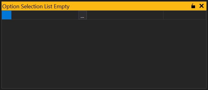
When you first create an Option list you will be shown a blank list with a single blank entry:
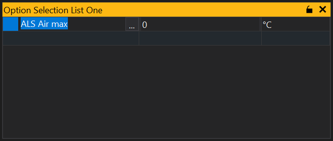
To add an option simply start typing the name of the option and GWv4 will provide a list of likely options or click the ‘…’ button and you will be shown a list of all available options. Select the option you want to display and click ‘OK’. This will add the selected option to the list and provide a new blank entry from which to select another option:
Adding Multiple Options
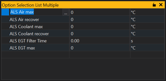
From the option selection list you can add multiple options. Click on the ‘…’ button to bring up the available options, then either click and drag over the options, or use mouse click and either Shift or Ctrl keys to select separate items. Once selected, click ‘OK’ and the items will be added to your selection list:
Locking the List
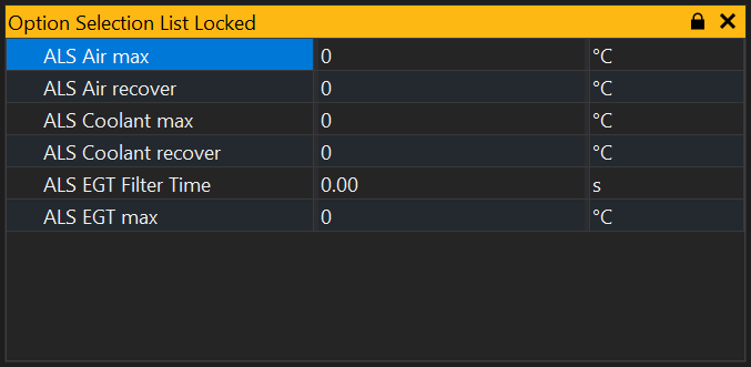
The selection list may be locked so that no items can be added or removed from the list by clicking on the  button in the title bar. It is also possible to toggle locking from the context menu (right click).
View Properties
Properties editable via the properties editor.
| Property | Script ID | Description |
|---|---|---|
| Title | title |
The title of the window. |
| Script ID | id |
The scripting ID of the window. Can be used as an alternative to the title for searching for windows from scripts. |
| Tool Tip | tooltip |
Window tool tip. |
| Font Size | font_size2 |
Size of the text used in the list. |
| Minimum Font Size | min_font_size |
Minimum size of the text used in the grid with auto font size. |
| Maximum Font Size | max_font_size |
Maximum size of the text used in the grid with auto font size. |
| Auto Font Size | auto_font_size |
Automatically determine the font size based on the size of the grid. |
| Alpha Sort | sort_mode |
Sort items in the grid alphabetically. |
| Condensed | condensed |
Condenses items into groups based upon the first word in the name. |
| Name | show_col_name |
Sets whether this view should display the 'name' column. |
| Identifier | show_col_ident |
Sets whether this view should display the 'identifier' column. |
| Display Identifier | show_col_display_ident |
Sets whether this view should display the 'display identifier' column. |
| Long Identifier | show_col_long_ident |
Sets whether this view should display the 'long identifier' column. |
| Description | show_col_desc |
Sets whether this view should display the 'description' column. |
| Selected | selected |
Selected sites. |